
How do you make your product pages stand out?
What unique details can you add to these pages to make them resonate with your customers?
Most importantly, how can you optimize your product pages for higher conversions?
We’ve curated 20 effective product page examples to help you find answers to these questions and improve your product pages.
Be sure to read to the end. We share best practices for making your product pages stand out and increasing sales.
Let’s get started.
Creative Imagery and Design
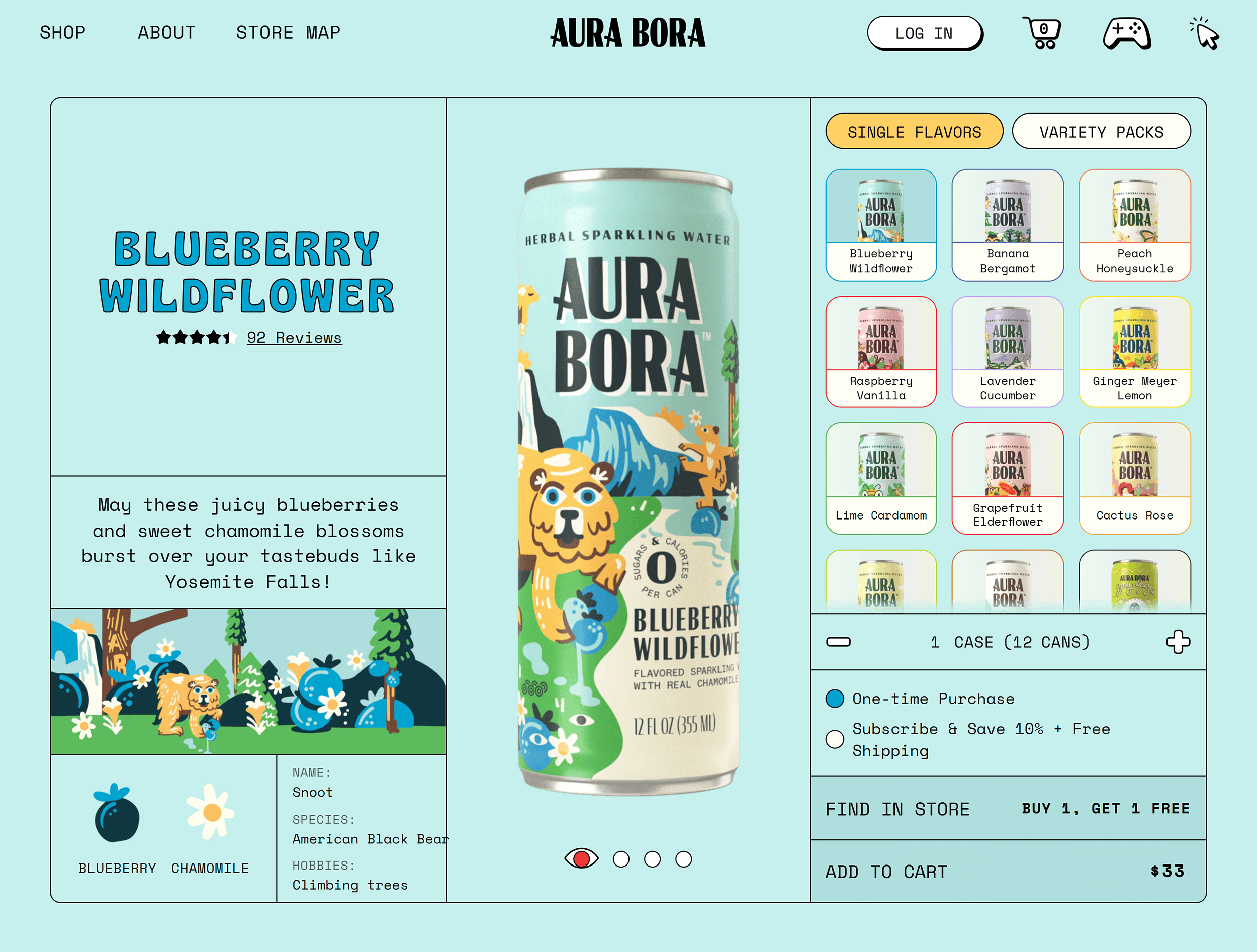
1. Aura Bora
Aura Bora sells sparkling water made with fruits and herbs. Its quirky brand personality is reflected in its packaging and website aesthetics.
On the left of their product pages, you’ll see a similar illustration to the one painted across that specific can. The entire product page uses the same color palette as this design to create a consistent theme.

The custom fonts and designs make this page stand out from other generic product pages. And they’re great for building brand recall.

Besides fun aesthetics, you’ll also find some unique details across the page—like tasting notes and a haiku describing each flavor.

And a percentage of people recommending the product (83% in this case).

Auro Bora’s branding played a role in securing a deal on Shark Tank in 2020.
Renowned entrepreneur and investor Robert Herjavek said, “This might be the best branding we’ve seen in all 12 seasons.”
What You Can Learn from Aura Bora
- Implement your brand’s personality traits through designs and illustrations that match your vibe
- Showcase your packaging on product pages to capture buyers’ attention
2. d’you
d’you is a skincare brand with a minimalist design approach. The brand has a limited collection of products, each represented by a color.

For example, the product “Good Grease” is expressed by peach and pink colors.
All the main elements on the page (like the icons, images, and text) are in different shades of that product’s color.

This page also uses visuals to show the product in action.
For example, the section on using the product visually explains when to use it and in what order, if you use the brand’s other products too. Which is a useful way to highlight more of the lineup.
This section also includes a short video showing how to use it (and how much to use).

All of these details make it super easy for potential customers to understand exactly what they get with this product. And it answers some common questions upfront.
The page also includes customer reviews categorized by ratings. Shoppers can click each rating bar to show only reviews that correspond to specific star ratings.

What You Can Learn from d’you
- Take a minimalist approach to product page design by creating color-coordinated pages
- Use simple videos, illustrations, and review sections to make it easy for users to find the information they need
3. Wanderlust
Wanderlust is a health and wellness brand that sells supplements and herbal extracts. This product page is a great example of a primarily monochrome design.

The hero section shares all the essential details with crisp copywriting. You’ll find the product’s name, a short description, and a few lines on its benefits.
This section gives buyers an overview of a product right within the first scroll.

As you scroll down, there are drop-down menus with more information about using the product. Along with important information about its ingredients and any associated health warnings. The drop-down menus provide detailed product insights without making the page too text-heavy.

The page also shares a description and illustration of the main ingredients used. Sharing insights about the main ingredients helps buyers understand the product’s benefits and sets clear expectations.

What You Can Learn from Wanderlust
- Provide all of the essential information near the top of the page
- Strategically use design details (like drop-down menus) to condense the text on your page and avoid overwhelming readers
4. Fable & Mane
Fable & Mane creates hair care products using ancient Indian recipes. The brand’s logo and design style are rooted in Indian aesthetics. Using herbs and leaves as constant design elements.

The hero section includes a carousel of slides, which is a mix of infographics, videos, and user-generated photos.
The variety of graphics ensures potential customers can discover the product’s ingredients, use cases, and benefits straight away. They can also see the product in action and understand its impact with helpful before-and-after images.
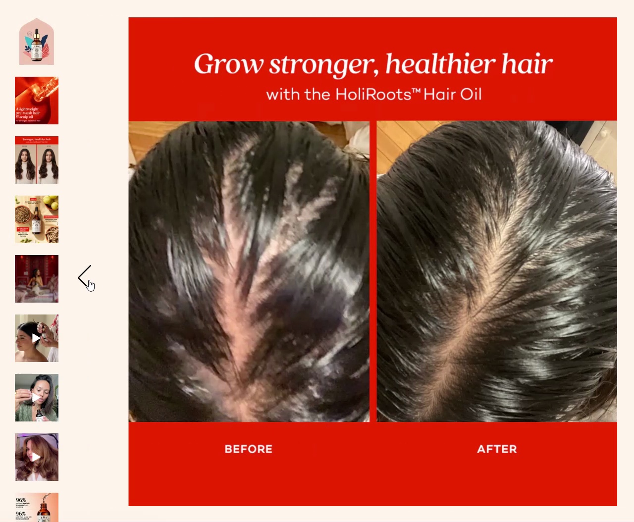
You’ll then see relevant details below the hero section, like fragrance notes and the scent.

Each page also includes an illustrated video showing the bond between a tiger (the brand’s mascot) and a woman.
This video highlights the message of preserving tigers while emphasizing how Fable & Mane helps women strengthen their own “mane.”
But it’s also a great way to spread the word about the Fable Fund. Which is dedicated to protecting the natural habitats of tigers.

What You Can Learn from Fable & Mane
- Create standout product pages using brand-relevant imagery, like Fable & Mane’s tiger and nature motifs
- Implement user-generated content and before and after images into your carousels to build trust around your products
Interactive Engagement Elements
5. Anyday
Anyday sells cookware products and kitchen accessories. Its product pages are designed for savvy buyers—the ones who do thorough research before buying anything for their kitchen.

The media library in the hero section of the product pages includes:
- High-definition product photos
- GIFs showing the product in action
- Infographics highlighting unique features
With all these details up top, potential customers get a clear picture of how the product looks and works. Along with key details like whether it’s safe to use in the microwave or dishwasher.

If that’s not enough, there’s a whole section of videos of Anyday customers showing the product in action. That’s social proof and usage instructions for interested buyers—a win-win!

Anyday’s product pages also feature a visual measurement scale that gives users a clear idea of each item’s size and volume. Helping shoppers choose the best product for their needs.

What You Can Learn from Anyday
- Show your product in action with user-generated videos to build social proof and give buyers the confidence to make a purchase
- Include elements like comparison tables to help buyers compare and contrast different options to make an informed buying decision
6. Brilliant Earth
Brilliant Earth sells wedding rings and gemstones.

Each product page includes an interactive video that allows you to rotate the item to see a complete video of its design, build, and gemstone work.
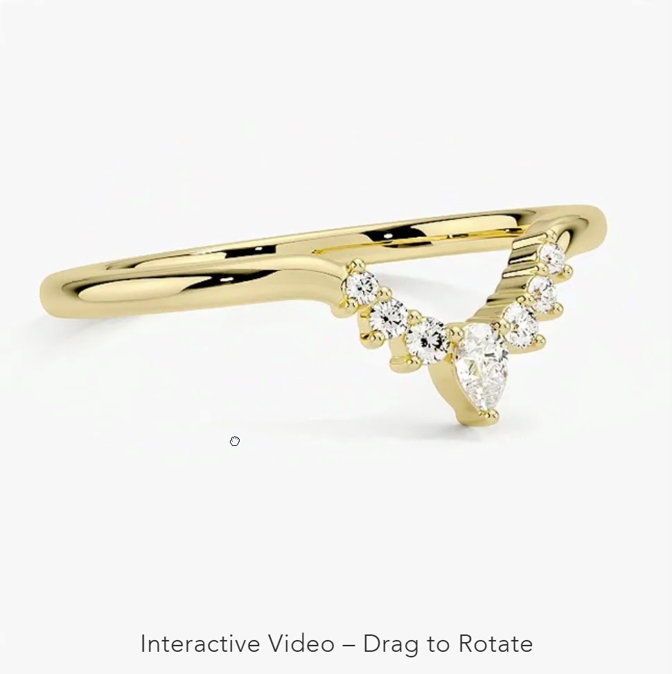
This interactive element makes it easy for buyers to examine the ring’s look and feel from all angles—like they would if they tried on a ring in a physical store.
The page also includes a sliding scale to see how the ring looks on different skin tones.
You can slide the scale to the color that best matches your hand. This creates a tailored buying experience and gives shoppers more confidence when choosing a product.
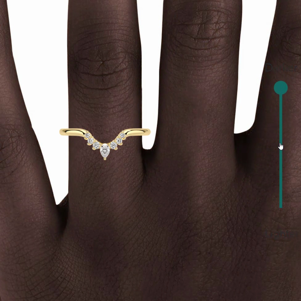
Further down the page, you’ll see a social proof section that shows customers wearing Brilliant Earth’s rings. This section gives you a glimpse of how these rings make people’s big day more special.

These interactive tools can work well to pique curiosity and turn casual shoppers into customers. Here’s a Brilliant Earth customer sharing how they used the “create your own” tool on their website to design their ring before buying it from the store.

What You Can Learn from Brilliant Earth
- Include interactive elements to let buyers explore your products and tackle their objections to help them make the right call
- Recreate a real-life experience using interactivity when selling products that customers want to try on before buying
7. Lenskart
Lenskart is an Indian eyewear brand, and its product pages solve a critical problem for online shoppers.

Along with images of different people wearing each pair of glasses, Lenskart offers a “Try On” option. With this, you can turn on your camera, try any pair of glasses virtually, and see which ones best suit your face.

This virtual try-on feature works well because, as with the rings in the previous example, people tend to want to try multiple options when buying glasses.
What You Can Learn from Lenskart
- Create a virtual try-on option to help shoppers discover how your products would look on them
- Add customer photos to build more social proof and show your products being worn by different people
8. Wild One
Wild One is a dog fashion brand that sells leashes, collars, pouches, and more.

The page opens with a hero section containing all essential product details. That means potential customers don’t have to scroll far to find different colors, sizes, and materials when making their decisions.
On the left of the hero header, you’ll see high-quality photos of the product, showing it in action with different types of dogs. These visuals change for different colors. So, you can conveniently check out each color and choose the best one for your dog.

The hero section also shows a small pop-up playing user-generated videos. When you click on a video, you’ll enter a gallery featuring more videos from Wild One customers.
This helps build trust because shoppers get a real-life glimpse of the product. And can learn more about its performance directly from real customers.

Further down the page, you’ll find a section on sizes. It shows small video clips to help buyers measure the right size for different products. This is great for first-time buyers who may need help finding the best fit for their dogs.

What You Can Learn from Wild One
- Add user-generated videos to help build trust while presenting different ways existing customers use your products
- Create dynamic images for products available in multiple colors or sizes to help buyers choose the right option for them
Compelling Sales Drivers
9. Nutribullet
Nutribullet is known for its blenders and juicers. Its product pages have several features to make it as easy as possible for shoppers to make a purchase.

For example, the hero header shows different versions of Nutribullet’s flagship product.
You can easily switch between all the options in the Nutribullet catalog. This is an upselling tactic to make customers aware of more advanced models. Encouraging them to spend more money on a more premium product.

Below the hero section, you’ll find accessories and extras. This section is designed to cross-sell more items that people can use with the main product. With the word “Enhance” suggesting to buyers that these will improve their experience.

Further down the page, you’ll see the reviews section. It includes a badge indicating that all reviews are managed by a third-party platform called Bazaarvoice.
This section also highlights how many reviewers recommend this product (86% in this case). This helps give potential buyers the confidence to place an order.

What You Can Learn from Nutribullet
- Drive more conversions and nudge shoppers to buy more with strategic cross-selling and upselling tactics
- Supplement your sales drivers with social proof through authentic customer reviews and ratings
10. Brooklinen
Brooklinen sells bed and bath products. All its product pages give you clear options to pick your preferences and place an order with ease.

Each page also has a pop-up highlighting a freebie for orders above $299. This encourages buyers to spend more.

Right under the “Add to Cart” button, you’ll see the number of people who currently have this product in their cart. This creates a sense of urgency among shoppers to buy the product before it sells out.

When you scroll down the page, you’ll find a section listing other related products you might want to buy.

This is a classic cross-selling technique that lets shoppers explore additional items they can use with the main product. Like we saw above with Nutribullet’s accessories.
What You Can Learn from Brooklinen
- Add strategic copy to create a sense of urgency or scarcity and convince shoppers to buy immediately
- Include information about complementary products to encourage customers to spend more
11. Boy Smells
Boy Smells is a brand that sells candles, perfumes, and other fragrance products.

Each product page gives you three purchase options up front:
- Make a one-time purchase
- Get a 30/60/90-day subscription (and get a discount)
- Buy with four interest-free installments
These options give shoppers the convenience of choosing a preferred payment method that suits their needs. Removing a barrier to purchase.

Further down the page, you’ll notice two sections: one for products related to the main item, and another for bestsellers.
Each product also has a “Quick Shop” button, which gives you a preview of the product with a one-line description and a few key attributes. This makes it easy for shoppers to browse related items and add more to their carts.

What You Can Learn from Boy Smells
- Inform shoppers about all available payment methods to make it as easy as possible for them to buy
- Enable quick browsing options for related products to let buyers choose additional items in a few clicks
12. Crossrope
Crossrope is a fitness brand that sells different kinds of ropes and fitness program memberships.

Each of its product pages offers other “frequently bought together” products. And they’re often discounted too. This is a great way to cross-sell other items.

The small tagline “In stock & ready to ship” also reassures shoppers that the shipping process won’t take long. Answering a common objection.
You’ll also notice the “Try risk-free” button under these options. That’s another powerful sales driver to attract free users that can convert into loyal customers.

But this final section steals the show, inviting shoppers to join the Crossrope community. It also has one main CTA for shopping for a bundle with the rope and membership.
It’s a great example of community-led brands influencing potential customers and driving sales with social proof.

Spotlighting the community on its product pages is a great move for Crossrope. It incentivizes other customers to post on socials and get featured on the website.
The result? There are nearly 50,000 posts for #crossrope on Instagram alone.

What You Can Learn from Crossrope
- Show the impact people have experienced with your products and invite shoppers to experience a similar effect by building a community
- Bundle relevant products into a package and offer discounts to maximize order value
Clear Transparency and Trust Signals
13. Copenhagen Grooming
Copenhagen Grooming sells men’s grooming products and transparently shares how its products are making a difference for customers.

Each page features a “Growth Guarantee” section. This area explains the company’s promise to offer a complete refund if you don’t see results in 150 days and outlines the steps to claim this refund.
This transparency can help put hesitant customers’ minds at ease.

Below the hero section, you’ll find before and after photos from real customers. You can move the slider to see the complete photos before and after using the product. This is a great interactive element that presents stronger social proof than text-based reviews alone.
People can tangibly see the product’s impact to assess whether it actually works.

What You Can Learn from Copenhagen Grooming
- Add concrete evidence to show the impact of your products with before and after images from your customers
- Share tips on how to use, clean, and maintain your products and set buyers up for success from day one
14. Spacegoods
Spacegoods is a supplement brand offering various blends. Its product pages feature various trust signals, starting with a 60-day money-back guarantee.

The section highlights that customers can:
- Skip or cancel anytime
- Enjoy free shipping
- Get a discount
These details collectively help build trust and encourage people to place an order or learn more about the product.

What makes this page even better is a section that transparently breaks down the science behind each product. It discusses different ingredients and how each one can achieve a promised benefit, citing research papers.
Such a comprehensive breakdown of product ingredients shows buyers that you’re not making empty promises. And all benefits are backed by real evidence.

Another great detail on this page is this section highlighting the brand’s four key value propositions compared to its product’s biggest competitor: coffee.
This format works great when you want to differentiate your product and a make case against a single main competitor.

The page also shares over 2,000 customer reviews from verified buyers. These reviews are collected from a third-party review app called Loox.

And the brand is obviously doing a great job building trust as it has also amassed thousands of positive reviews on Trustpilot.

What You Can Learn from Spacegoods
- Share scientific evidence or behind-the-scenes details to offer complete transparency about your products
- A money-back guarantee, subscription perks, and clear sales copy that speaks directly to buyers can play a key role in gaining buyers’ trust
15. Kolkata Chai Co.
Kolkata Chai Co. sells tea bags and concentrates.

The product page emphasizes crucial differentiators to gain buyers’ trust, showing off that the brand uses:
- Organically grown tea and spices
- Less sugar than other brands
- Recyclable, eco-friendly packaging

There is also a table comparing the brand’s products with two alternatives. It talks about five main criteria to help buyers make the right decision.

The page ends with customer reviews from verified buyers. Adding yet another trust signal to instill confidence in potential customers.

What You Can Learn from Kolkata Chai Co.
- Present an honest comparison of your product compared to alternatives to gain buyers’ confidence
- Share behind-the-scenes details about your product’s manufacturing process to show buyers how much effort goes into each item you sell
User-Friendly Content and Layout
16. Cancha Bags
Cancha Bags sells sports and adventure goods, like backpacks, tennis rackets, and more.

The hero section of its product pages provides a brief list of three “signature advantages” for every product. Along with a short customer review. Making it easy for shoppers to quickly learn more about each product’s quality.
Right below the “Add to Cart” button, you’ll find details like Cancha’s sustainability pledge and the brand’s shipping & returns policy.

Clicking the “How to Attach Accessories” button opens up a short instructional video.

You also have the option to chat with Jack, a member of their customer support team. This is a great way to condense all the important details in the hero section and offer direct support to help buyers make a confident purchase decision.

Further down the page, you’ll see a video of a person actually using the product to demonstrate its functionality. Real-life videos like these give online shoppers a better idea of a product’s shape, size, looks, and use cases.

What You Can Learn from Cancha Bags
- Deliver a seamless buying experience by giving people the option to chat with someone from your team
- Use a combination of short clips and longer videos to educate buyers about your product, showing how it works and providing tips to get the most out of it
17. Supply
Supply is a men’s grooming brand.

Each of its product pages opens with a detailed hero section. Here, you can find all the essential details, like:
- Usage instructions
- Personalization options
- Other FAQs
As you scroll down the page, you’ll find a section highlighting three of its unique selling points with relevant infographics. These give users a quick preview of a product’s capabilities and key features.

Then there is a GIF comparing the change in pricing for Supply’s single edge razors versus other popular brands. It acts as a convincing trust signal to inform buyers that Supply offers quality products at a better price than its competitors.

Finally, one more detail that makes this product page stand out is a snippet featuring the founders. This section briefly highlights why they started the brand and what they want to achieve.
Learning more about the founders can forge a stronger connection with buyers because they can get to know the people behind these products.

What You Can Learn from Supply
- Show off key features of your products and how they help set you apart from your competitors to convince buyers to choose your brand
- Add your origin story or share a word from the founders to humanize your brand and add a personal touch
18. Stasher Bag
Stasher makes sustainable storage solutions.

The hero section for every page emphasizes its core benefit: replacing plastic bags. It’s a good example of a minimalist hero section focusing entirely on one primary benefit.

Further down the page, you’ll see how the brand educates shoppers about products in different sizes. This is user-friendly as shoppers don’t have to open each page individually and measure its size.
They can compare multiple sizes immediately and pick the one that fits their needs.

The page also includes lots of social proof with customer reviews.
You even have the option to like or dislike reviews that were particularly helpful (or unhelpful).

Besides customer reviews, there’s also a collection of articles on the best ways to use Stasher products. Helping potential customers learn more before making a purchase.

What You Can Learn from Stasher
- Write articles to guide potential customers about how to use your product and win them over
- Add a thumbs-up or thumbs-down option for customer reviews to highlight the most helpful reviews on top
19. Bombas
Bombas is a comfort clothing brand. Its product pages open with a hero section where you can scroll through various product images.

Below this section, each page covers three primary details:
- The fit
- The feel
- The look
These details give you a quick preview of how a product is designed. Along with supporting visuals to provide context on each characteristic.

Further down the page, you’ll find a section on Bombas’s charity initiatives. It redirects you to a page explaining how the brand donates a portion of all orders to give back to society.
The engaging copy and image are designed to capture people’s attention. And the CTA gently pushes them to learn more about the initiative.

What You Can Learn from Bombas
- When creating a minimalist design, focus on adding standout details, such as a slider image carousel and highlighting a few key features or selling points
- Highlight any charity initiatives with striking colors or icons to bring more eyes to this section and spread awareness
20. House of Noa
House of Noa sells different types of mats for household needs.

Every product page includes:
- A set of pictures and videos of the mat
- A short description of its materials
- The available colors and sizes
- A size guide
This gives shoppers all the key details to make an informed purchase right away.
Plus, the page presents social proof up front with a section featuring some Instagram posts, followed by customer reviews. These sections show how the product looks in different settings and what customers think about it.

The page also highlights three core value propositions for each product. Each one is presented with some concise copy and an image.
This minimalist design approach is fairly easy to replicate and focuses on answering buyers’ questions with complete clarity.

The final section shares a quick word from the brand’s founder. This short snippet tells you the founder’s personal motivation behind starting the brand. And the language used is likely to resonate with many potential buyers in need of a stylish mat that provides comfort for their kids.

What You Can Learn from House of Noa
- Show your product by placing customer photos and user-generated content right below the hero section to help potential buyers better understand its look and feel
- Cover key product features with relatable copywriting to address buyers’ objections
Best Practices to Create Standout Product Pages
After reviewing some of the most impressive product pages on the web, here are four best practices to help you wow your buyers and drive conversions:
Address Buyer Objections
Answer your potential customers’ biggest objections on your page. To make it easier for them to click the buy button.
You could add instructional videos on using your product so that customers know what to expect. Or an interactive element to present a 360-degree view (like the Brilliant Earth page we shared earlier).
For example, this product page for one of Breville’s coffee machines includes an explainer video for making a latte with the machine:

You can also create tables comparing your product against competitors. To show customers why they should choose you. Like this one by BowFlex comparing top competitors’ products:

Offer Multiple Payment Options
Pricing can be a dealbreaker for many. You can win over potential customers and nudge them to buy by offering flexible payment choices. Such as interest-free installments or subscription discounts.
For example, this page by The Container Store specifies two payment options—one-time payment and four installments:

Tap into User-Generated Content (UGC)
User reviews are just one way to show social proof. Many buyers also want to see real customers using your product and hear directly from them.
You can include UGC videos across your product pages. For example, as pop-ups, in a separate section, or under your “Add to Cart” button.
Sacheu Beauty added a dedicated section on its product pages to showcase user-generated videos:

Balance Aesthetics with Function
Good visuals and compelling copy can fall flat if users feel overwhelmed going through your page.
So, conduct A/B tests to optimize your product page’s user experience. You can also use tools like Hotjar to monitor how visitors interact with these pages. Then you can iterate the design based on this data.
This product page by Cerebelly presents necessary details about ingredients in a friendly copywriting style:

Make Your Product Pages Shine
That’s a wrap on our 20 hand-picked product page examples to inspire your own.
Designing product pages your customers love is one thing.
But getting them to rank high in search results is a whole different ball game.
You need a strong ecommerce SEO strategy to rank well on search engines and get in front of potential buyers.
Check out our definitive guide to ecommerce SEO to optimize your product pages for success in the search results.


