Everyone says content marketing is great, but what are some really good examples that actually delivered?
To answer this question, we’ve put our Content Explorer to work. These seven examples came from filtering over 6.2B live pages in English by organic traffic and referring domains.
We will also share our short analysis of why these examples came out so well.
Estimated monthly organic traffic: 5.1M
Backlinks: 3.7K from 1.8K domains
Adobe. In case you’ve heard about its product but haven’t heard about the company, it’s responsible for putting the “photoshopped” in “this photo looks totally photoshopped.”
Its claim to fame on this list is a tool that automatically removes the background from any pic for free so you don’t have to. If you’ve ever tried to do this manually, you’ll know why such a tool is a lifesaver.
Why it worked
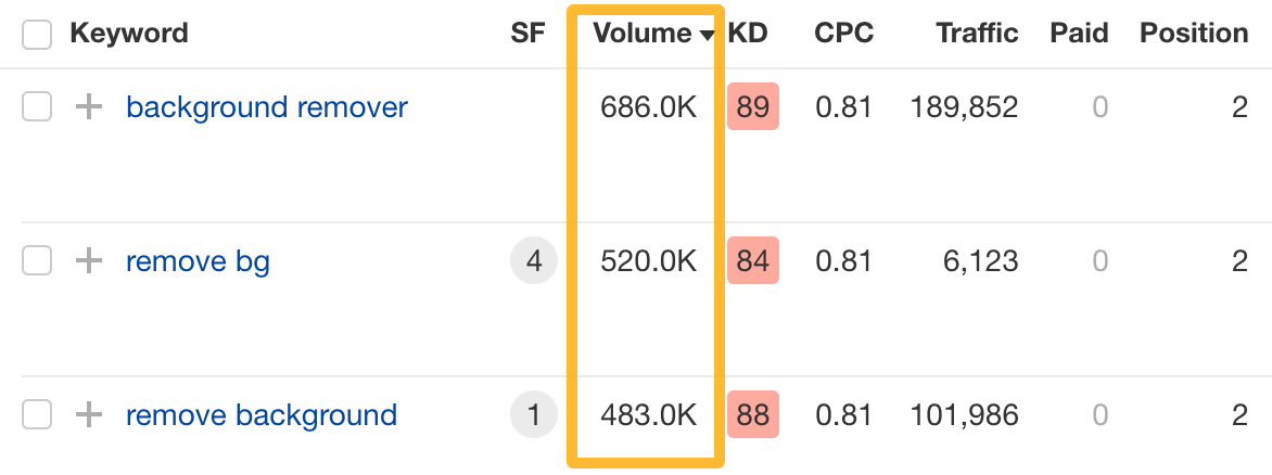
Millions of people search for a solution like this every month, and Adobe ranks in the top three every time.
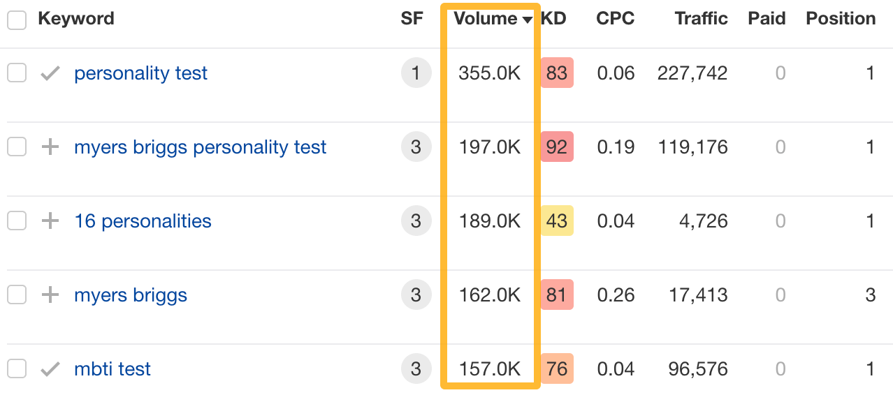
To illustrate, here are some of their top-performing keywords and their search volume in the U.S. alone.
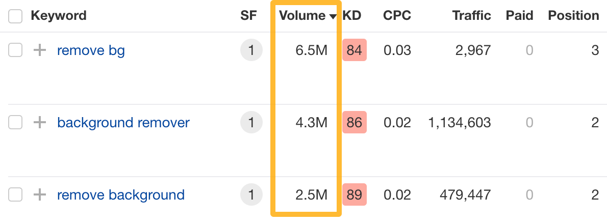
This site gets most of the traffic from India, where demand is even higher.
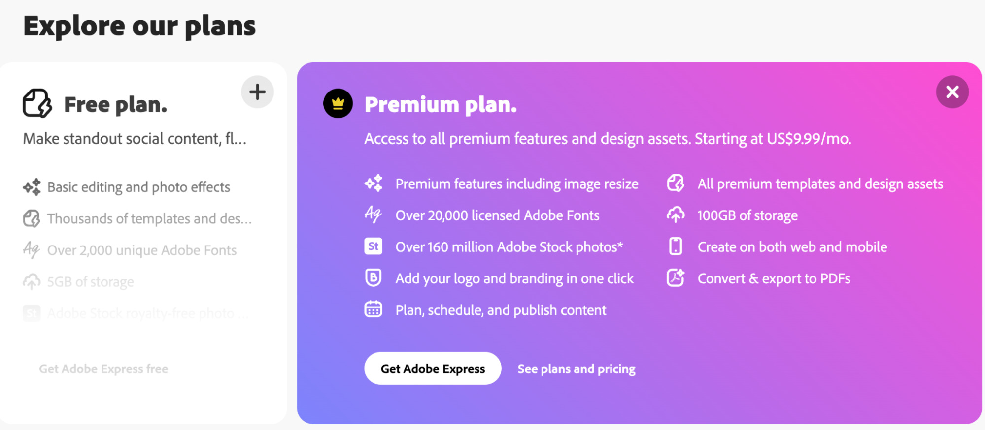
Naturally, it’s thought about a conversion path. Removing the background is free. But in case you need to resize the image too… Adobe always has a plan (pun intended).
Estimated monthly organic traffic: 2.8M
Backlinks: 20.9K from 10.3K domains
This content marketing example is so effective that someone built an entire business on it.
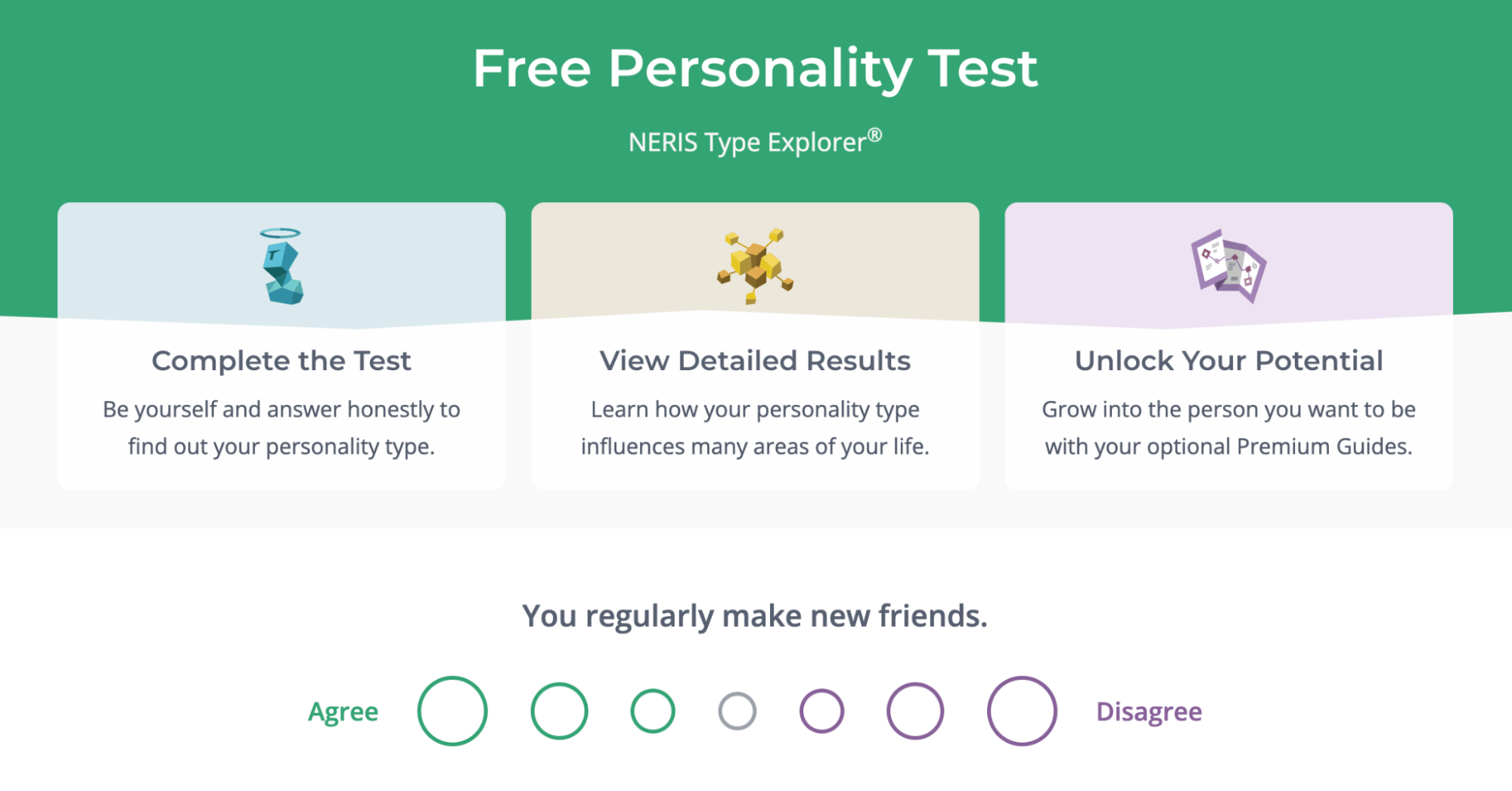
It’s a free personality test. The site sells premium content on personal growth, customized based on the test outcomes.
Why it worked
In short, many people want to learn more about themselves and the people in their surroundings, so they seek advice in personality tests like this one. This company created an experience that stands out in every aspect, which allowed it to take advantage of that demand.
This single page ranks for over 7K keywords, many of which have tens and even hundreds of thousands in search volume. This explains such surprisingly high traffic for “just” a personality test.
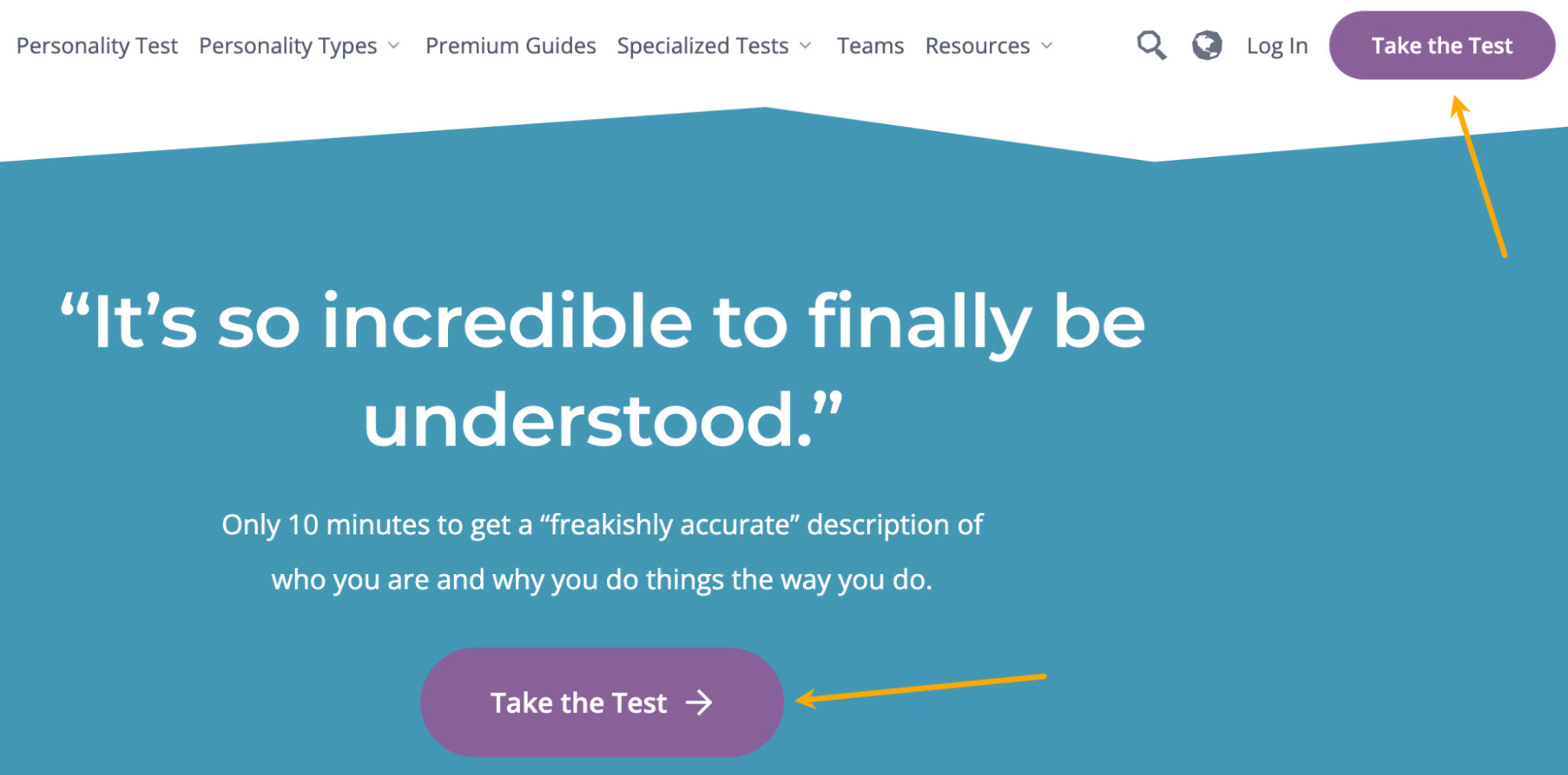
Another notable thing is how well the conversion path is designed throughout the site with the sole purpose of sending visitors to that page.
When you enter the site, there is absolutely no distraction; there’s 100% focus on the test.
After the test, you get a generous amount of free information on your personality. At that point, you’re most likely “hooked.” You’re then offered the opportunity to upgrade your experience: more advice, tips, and more specialized tests. And the site is selling this as frictionless as technically possible.
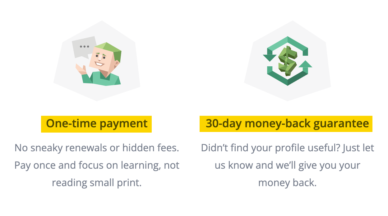
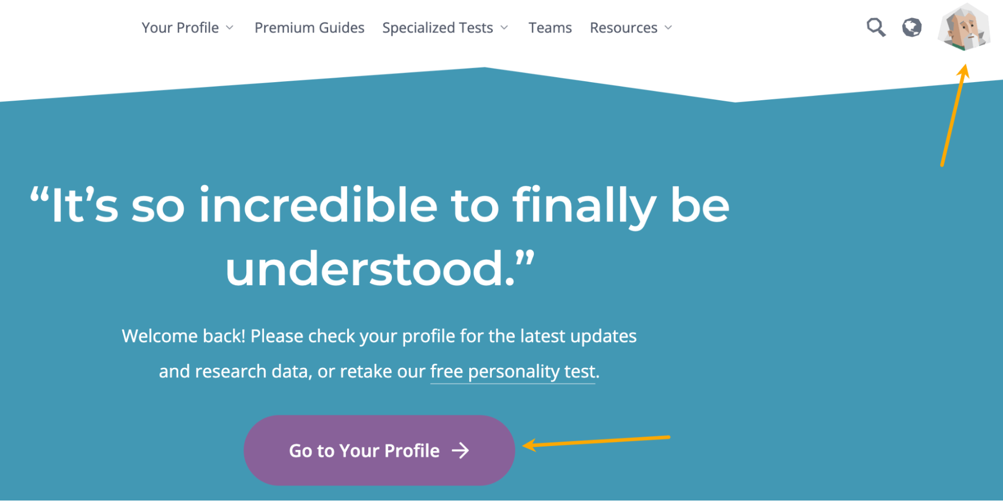
You even get an automatically created free profile which, I must admit, feels like your very own dedicated zone for personal exploration. Even the main CTA buttons change to lead you to your profile.
Estimated monthly organic traffic: 4
Backlinks: 4.1K from 329 domains
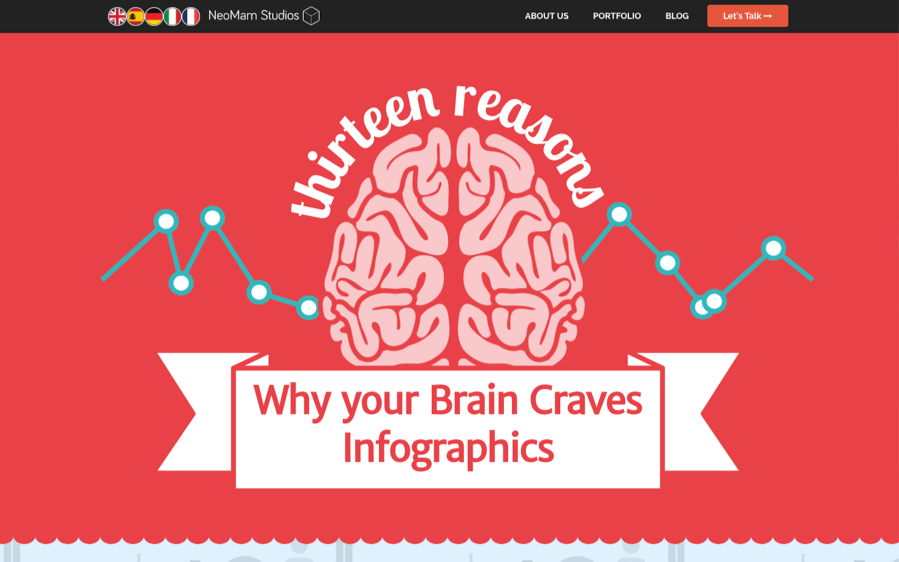
Launched in 2013, this is an infographic about why your brain craves infographics, created by an infographic design and marketing agency in the U.K.
It’s well designed and well researched. It’s also one of the few interactive pieces of content we’ve come across that actually resized correctly and worked on mobile (as of when this article was written).
Why it worked
The timing was almost certainly one of the biggest contributing factors here.
NeoMam published this piece of content in July 2013 which, according to Google Trends, was nearly the peak of a long-term trend of interest in infographics.
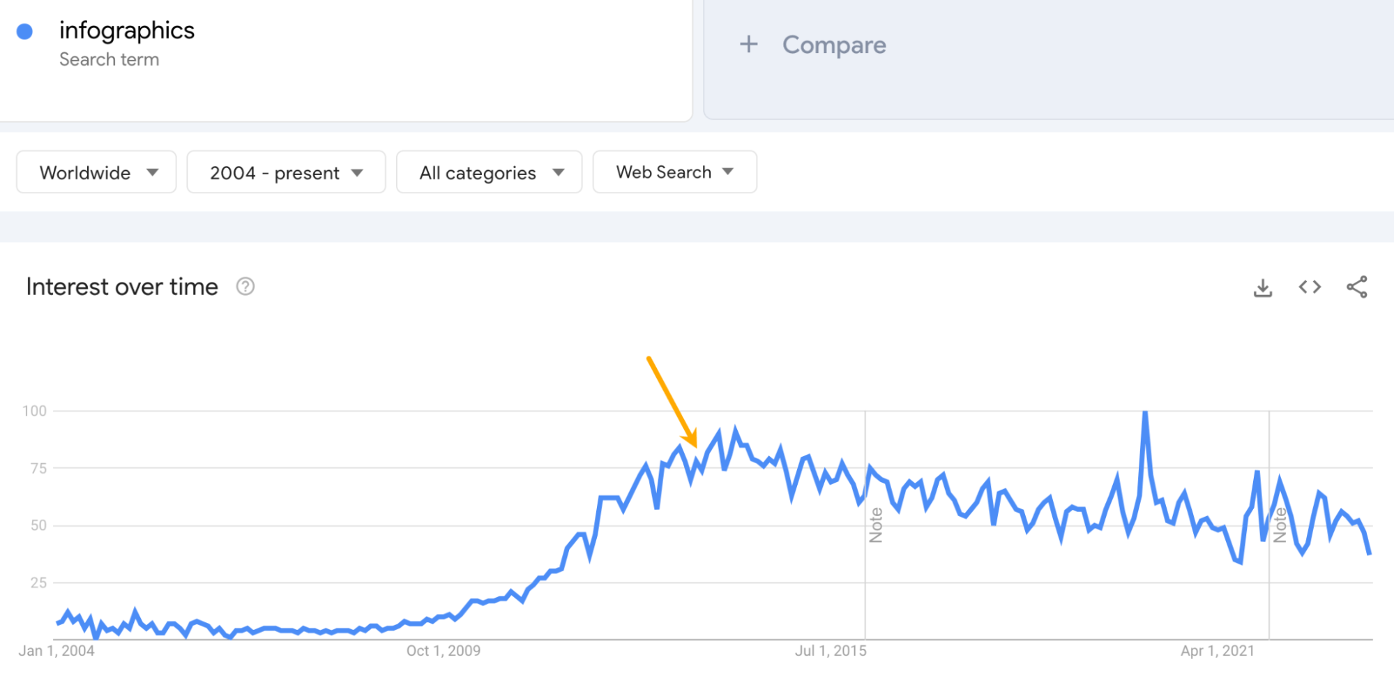
By publishing content about trending topics, you increase the pool of prospects who are likely to be interested in featuring the content. It’s akin to publishing something about the Barbie movie in 2023—if the content is good, journalists and bloggers will be falling over themselves to cover it.
And that’s exactly what happened in this case. NeoMam’s infographic got featured on a lot of huge sites, such as Huffington Post, Harvard Business Review, and Entrepreneur:
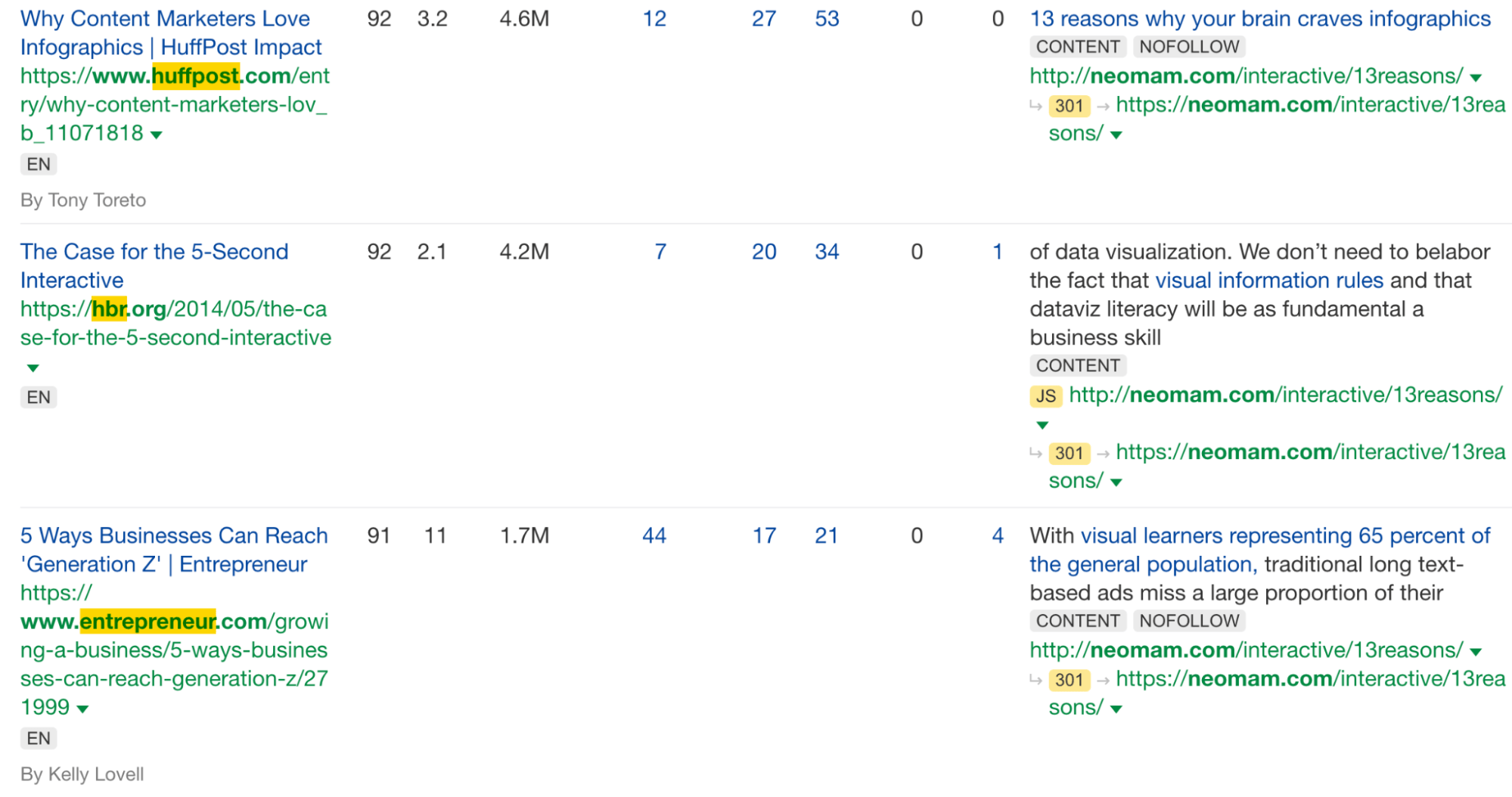
But what’s also notable is this work was featured in other lists like this one. So if someone looking for infographic inspiration comes across this example, they may hire the agency that created it.
Danny Ashton, the founder of NeoMam, also puts some of the success down to the quality and depth of research:
Back in 2013 you could get away with sources that didn’t quite make sense or just link to a blog. But one of the things I said to the team when we did this was to only talk about things that we could cite with a scientific journal. Going the extra mile when it comes to research quality was key for getting the trust from journalists looking to cover the story.

Estimated monthly organic traffic: 1.3M
Backlinks: 234K from 10.3K domains
CoinDesk is an online magazine devoted to cryptocurrencies, web3, and the underlying technology. This example is one of the web’s go-to sources for checking the latest price of Bitcoin and some related market data.
Why it worked
There are millions of searches for the live price of Bitcoin every month. With this page, CoinDesk ranks high for these searches and generates massive traffic it doesn’t need to pay for.
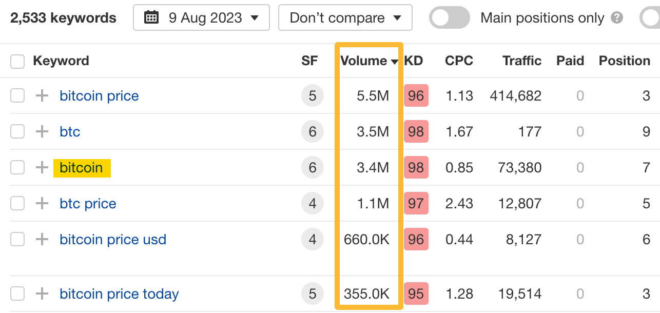
What’s in it for CoinDesk to go through all of that hassle to provide fresh market data? Especially when traders get their data from their trading apps? I can think of a few things:
- Advertising revenue from on-site ads, which get millions of views.
- Affiliate revenue—the “buy/sell” button you can see in the screenshot leads to third-party trading apps.
- Authority from all of the links pointing to that site. Which can, in turn, help it rank other content.
- Last but not least, increased readership. Its core content (news) is just a click away.
Estimated monthly organic traffic: 140K
Backlinks: 16.6K from 570 domains
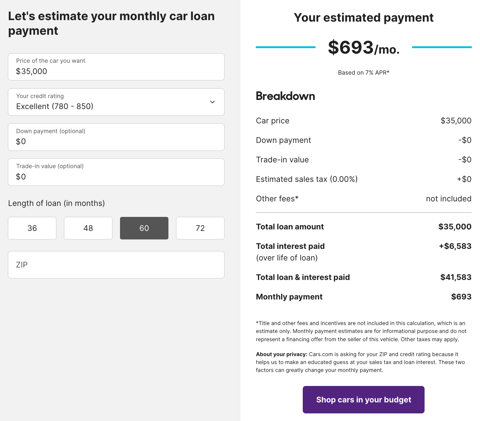
Cars.com’s Auto Loan Calculator does exactly what it says on the tin. But as you may have guessed, cars.com is not in the calculator business—it’s an online car marketplace.
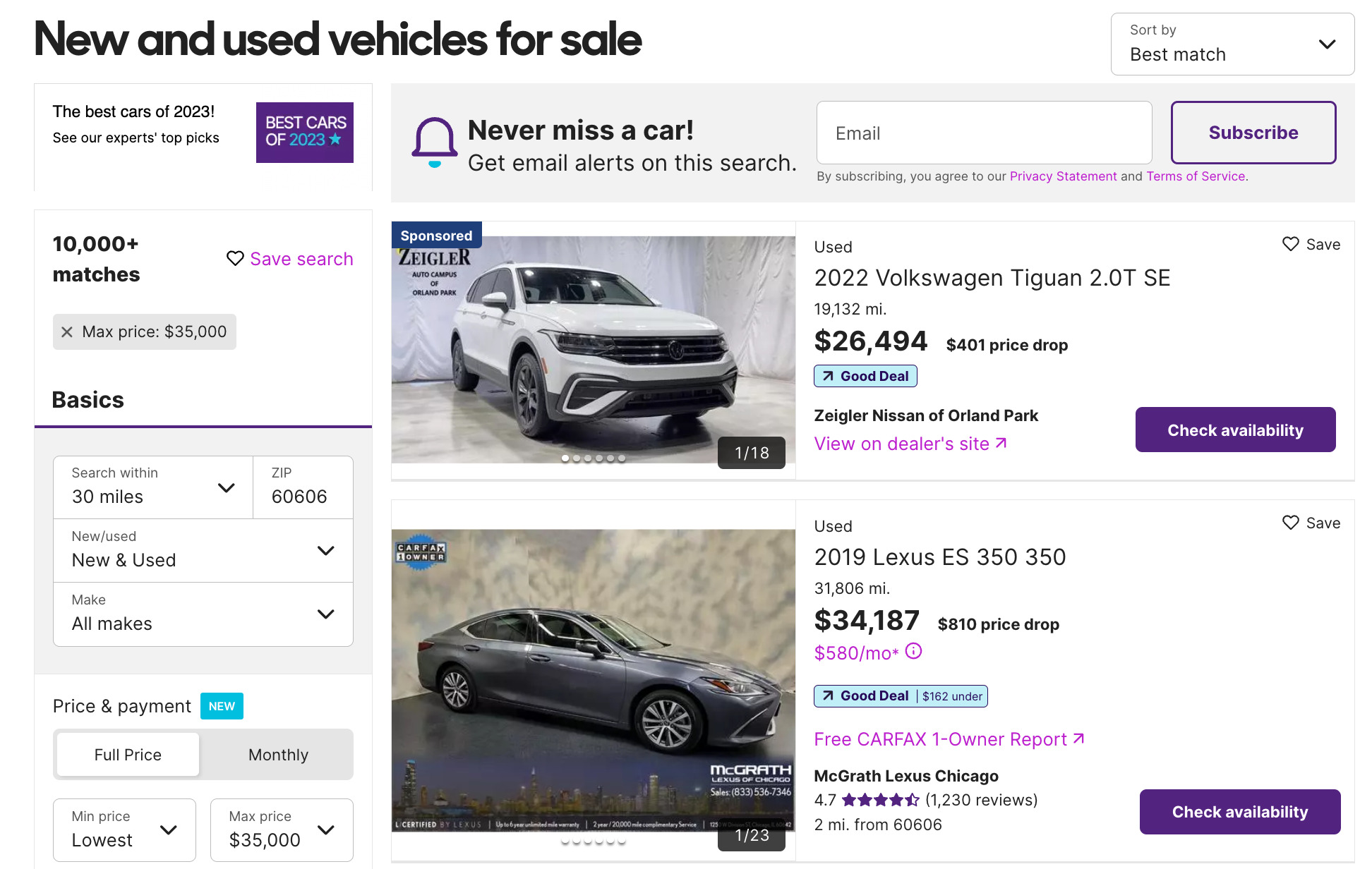
Once it calculates the monthly payment amount, there’s an auto-generated search box underneath that lets you “search for cars in your budget.” Of course, the list of cars comes from cars.com.
Why it worked
The phrase “car loan calculator” gets an estimated 475K monthly searches in the U.S.
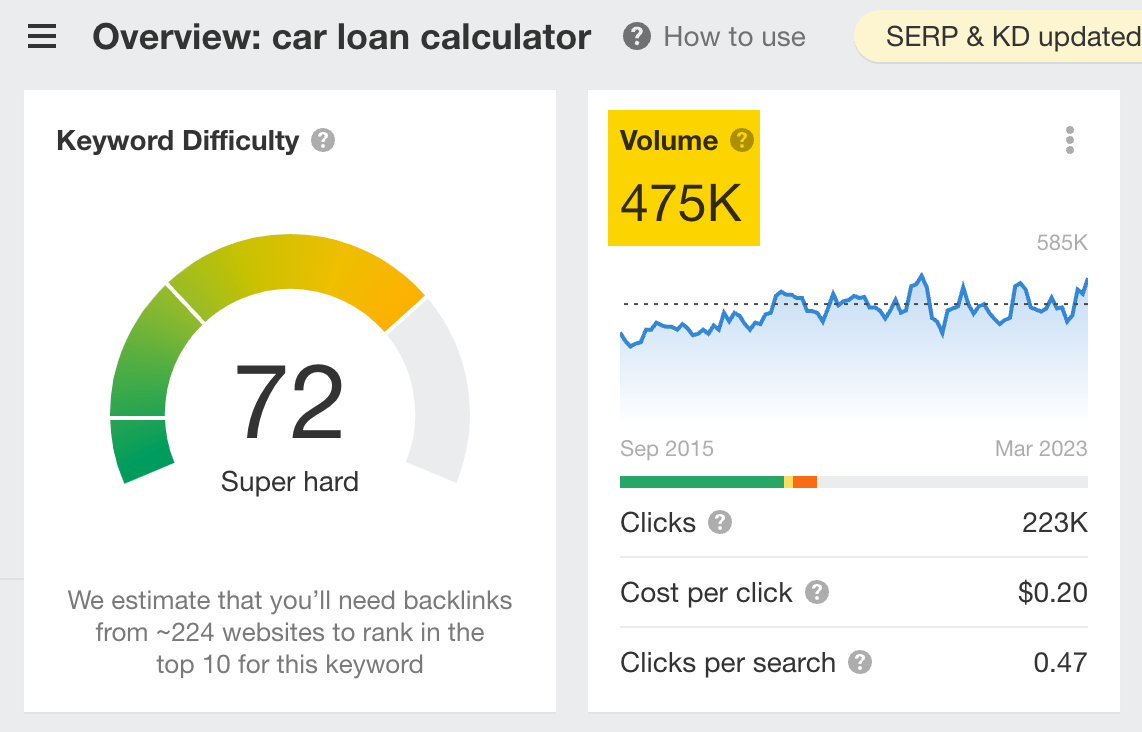
The calculator ranks in the top three in Google for that query. It also ranks in the top 100 for 8,970 other keywords, which also send traffic to the page resulting in an estimated 148,242 monthly visits.

That traffic then converts into leads when people search for cars on the website within that price range.

Estimated monthly organic traffic: 28
Backlinks: 1.1K from 545 domains
Superdrug, a health and beauty retailer in the U.K., asked female graphic designers from 18 different countries to retouch a photo of a woman to make her more attractive.
Here are just a few of the results:

A year later, it repeated the study with men:

Each resulting image and body type is vastly different from the rest—which is the entire point.
Superdrug aimed to show that there’s no such thing as the perfect body. It’s subjective, not definitive. What’s seen as the ideal body varies massively from country to country.
Why it worked
Superdrug launched this campaign in 2015 when, according to Google Trends, the body positivity movement was starting to gain traction.
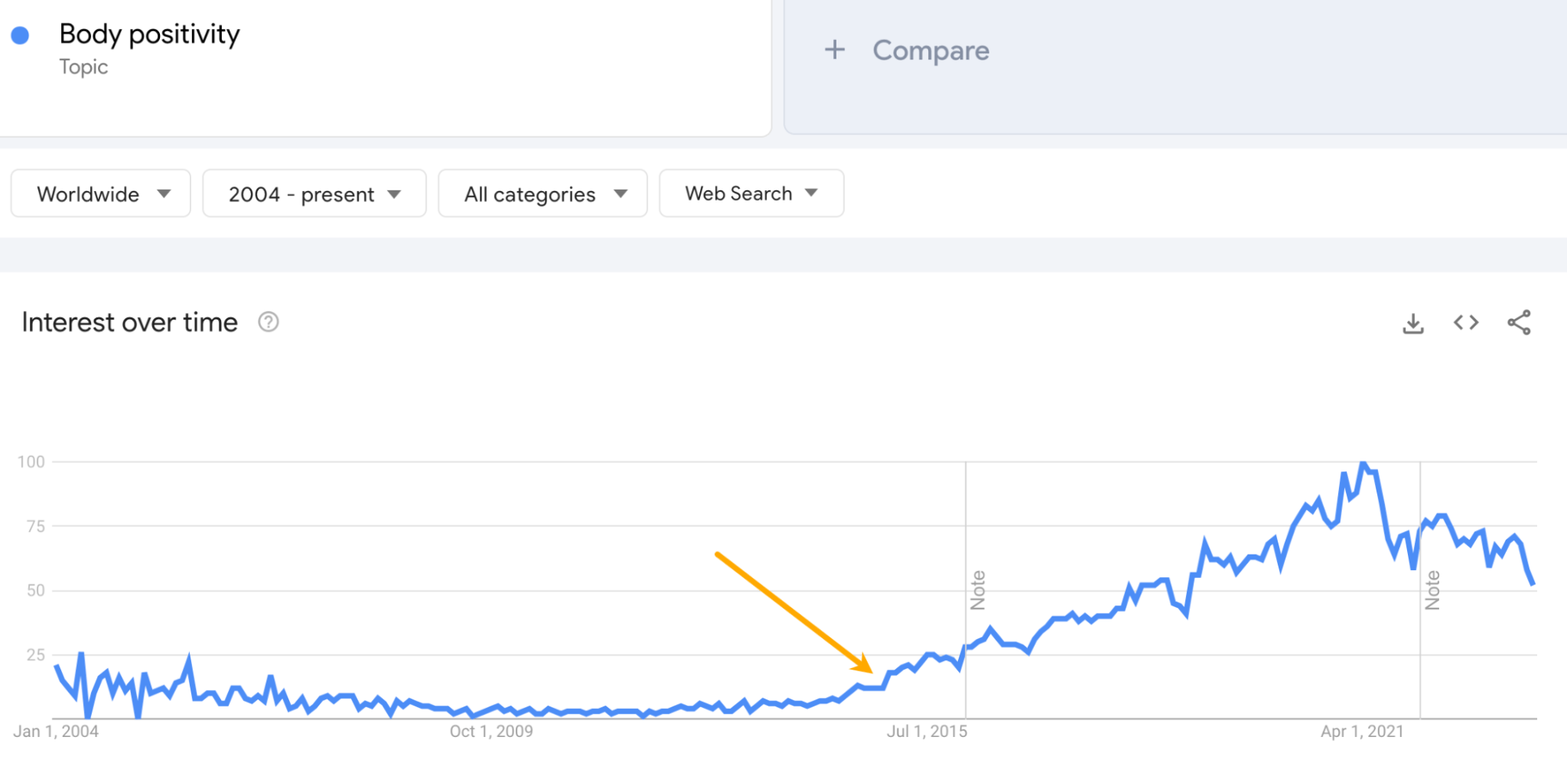
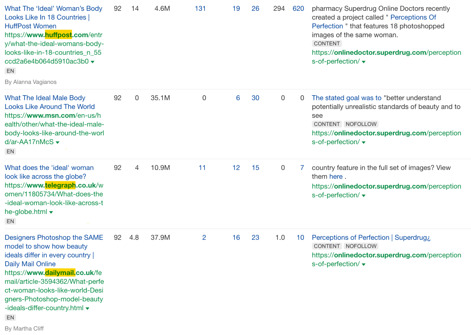
That meant there were many journalists and bloggers eager to cover positive, thought-provoking content around this subject, which led to features in big news sites such as Huffington Post, The Telegraph, and Daily Mail.
Estimated monthly organic traffic: 88
Backlinks: 475 from 329 domains
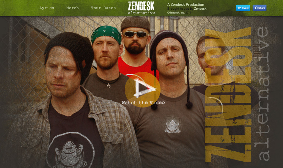
In 2013, Zendesk, a customer support solution, playfully created a fictional rock band called “Zendesk Alternative.” The band’s concept revolved around Zendesk stealing its name, leading to humorous and quirky situations.
Despite being entirely fake, Zendesk put in a lot of effort. It established the band on various platforms like Facebook, Bandcamp, or YouTube, giving it the appearance of a real act.
Why it worked
Not only is it funny and insanely well executed, but it actively targets customers considering other alternatives to Zendesk and attempts to win them over.
The page ranks in the top five search results most of the time on Google for “zendesk alternative,” a keyword that gets 800 searches per month in the U.S.
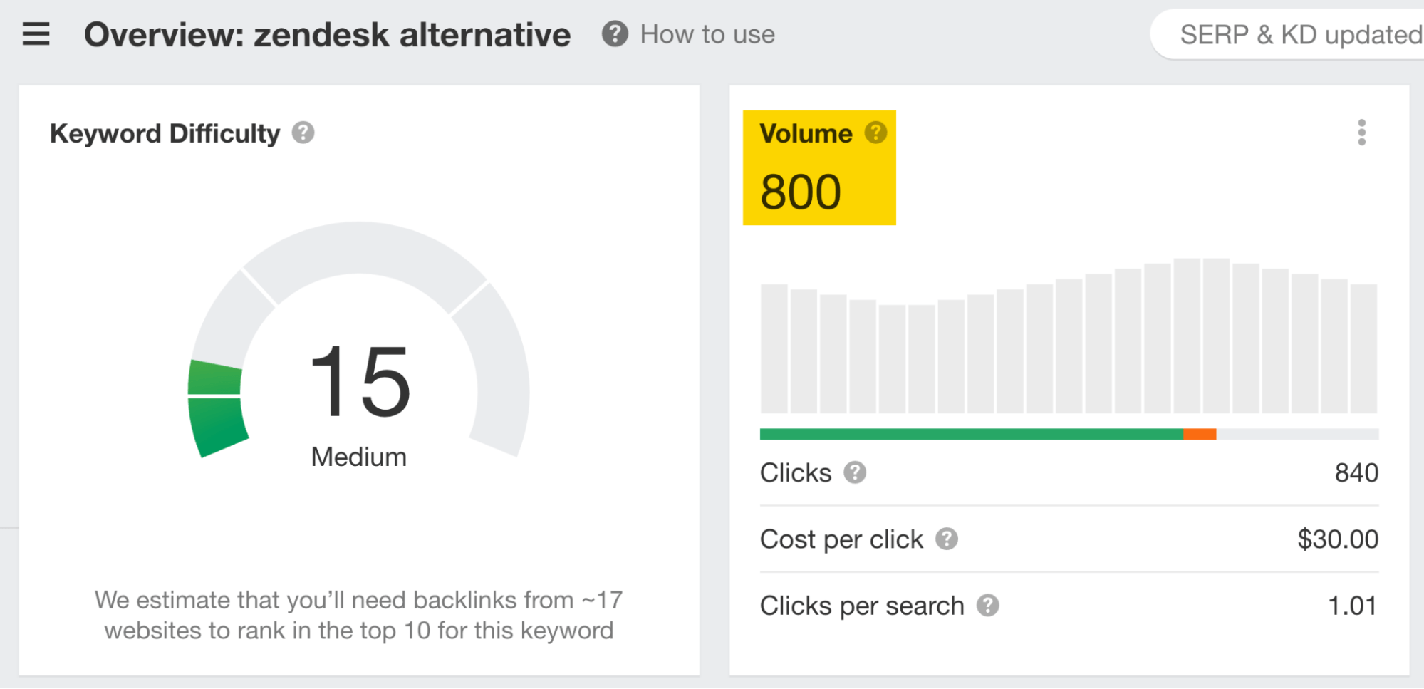
This is a keyword for which the bulk of traffic would ordinarily go to some other website.
Also, according to this archived article on radius.com, Zendesk closed five deals that originated from the Zendesk Alternative page within six months of the campaign going live.
Final thoughts
Every one of these examples relies on creating something of value (content) and promoting it to interested audiences (marketing).
They’re all relatively replicable and straightforward ideas at their core. Some of them may have required more resources, but others prove that you can create outstanding content even if you’re on a budget.
Do you know of any other cool content marketing examples? Let me know on Twitter or Mastodon.
Content Copyrights Belong to The Author. All Rights Reserved.
We're A Dallas Digital Marketing Agency That is Experts At Social Media Marketing, Website Design and Emarketing and Promotion.


