Your website’s design can make or break your ecommerce business.
After all, design elements have important jobs:
- Grab shoppers’ attention with eye-catching aesthetics
- Guide visitors smoothly from browsing to buying
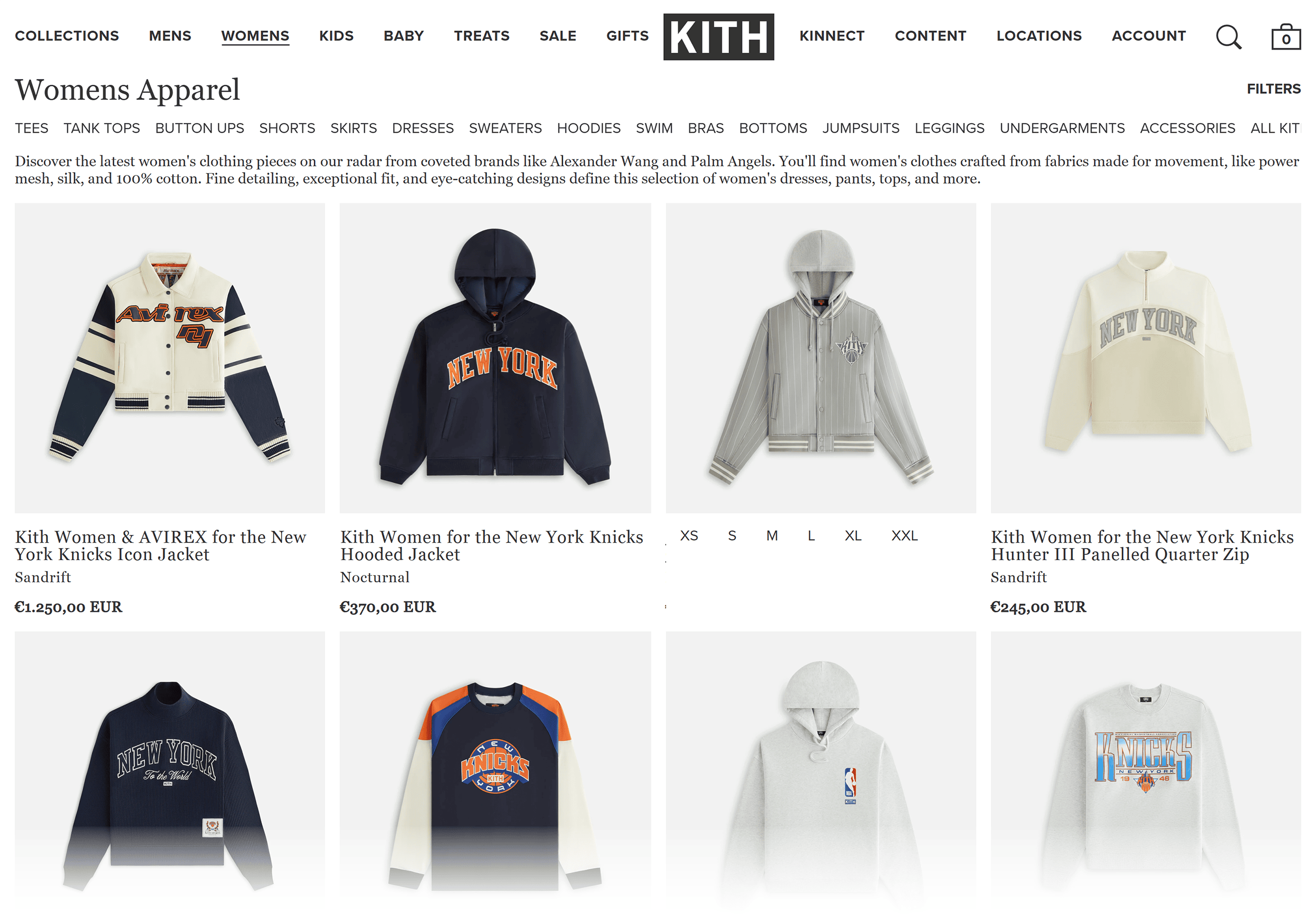
A great example of this is the streetwear brand Kith.
When Kith redesigned its website, it didn’t just focus on branding and colors.
It zeroed in on usability and functionality.
The result?
A staggering 235% increase in conversion rate.
Plus, their traffic is INSANE.
We’re talking 1.5 million monthly visitors.
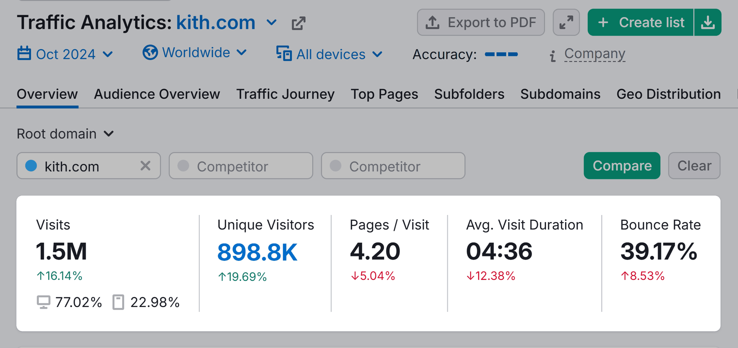
Even better?
Each visitor sticks around for well over four minutes, and the bounce rate is under 40%.
Clearly, shoppers love the brand’s website experience.
And your customers can love yours, too.
In this guide, you’ll learn exactly how to nail your ecommerce website design.
This includes proven strategies, real-world examples, and actionable tips.
Let’s start with the three essential elements that make ecommerce websites successful.
3 Essential Elements of Ecommerce Website Design
A successful ecommerce site has thoughtful UX and UI design, a mobile-friendly interface, and a checkout process that converts.
Get these right, and you’ll turn more browsers into buyers.
UX and UI Design
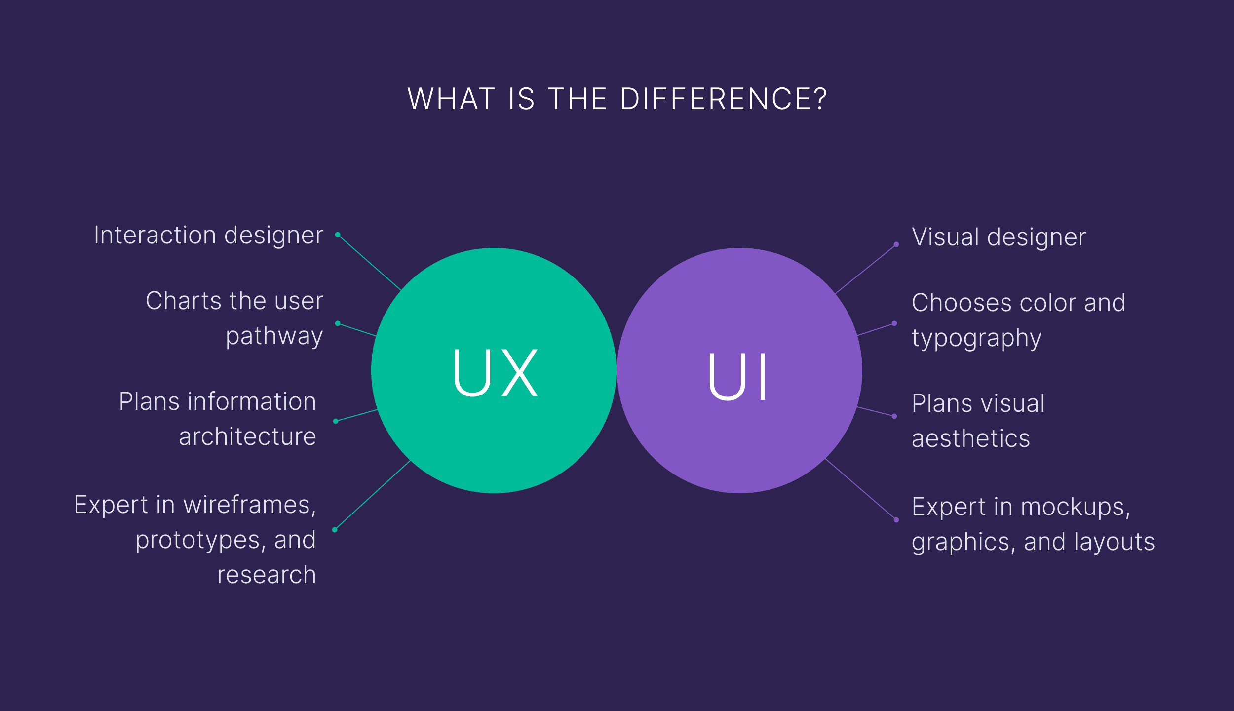
You might hear user experience (UX) and user interface (UI) mentioned interchangeably.
But they’re two very different concepts of website design.
Let’s briefly break down the key differences between these roles in ecommerce:
UX Design
Ecommerce UX design ensures users can easily navigate your site, from browsing to checkout.
Every click should feel intuitive to avoid frustrating shoppers and losing the sale.
To create a great experience, think about your users:
- Where would they look for product categories?
- Where would they click to find more information or add something to their cart?
- Are they able to find key details quickly and easily (like a size chart or shipping info)?
Bad UX, on the other hand, frustrates users and disrupts their shopping experience.
So, how do you start planning your site’s UX?
Start with a wireframe.
A wireframe is a basic visual guide that outlines your site’s structure and layout.
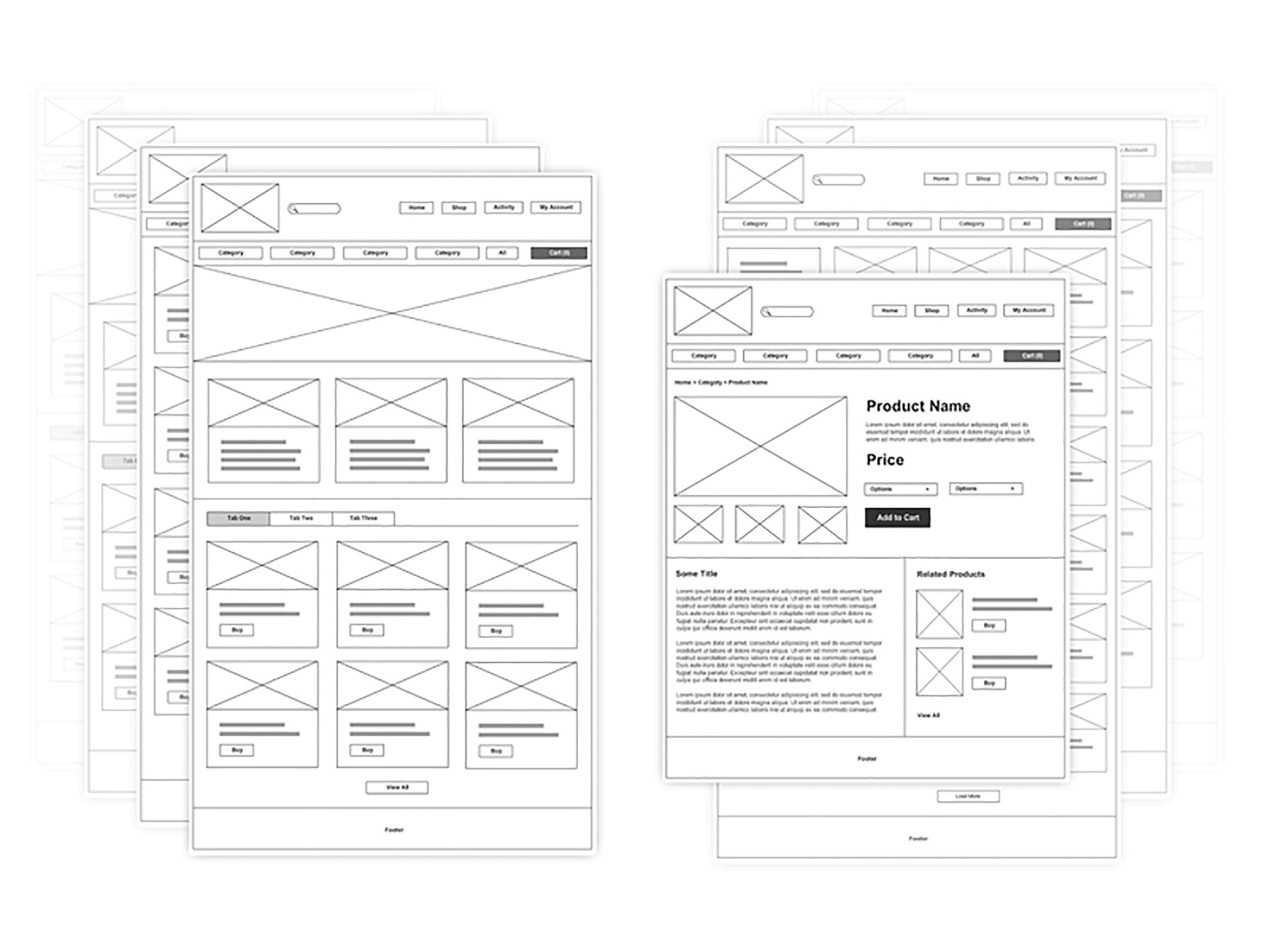
With a wireframe, you outline the placement of elements like buttons, menus, and content.
But you don’t get into visual details like colors, images, or fonts just yet. (Those belong in UI design.)
UI Design
UI design focuses on how your site looks, from product card layouts to checkout button styles.
And how users engage with your website visually.
It involves choosing the right visual elements to reflect your brand. So it’s consistent across your site and inspires trust.
When colors, fonts, and buttons are in harmony across your site, users know what to expect.
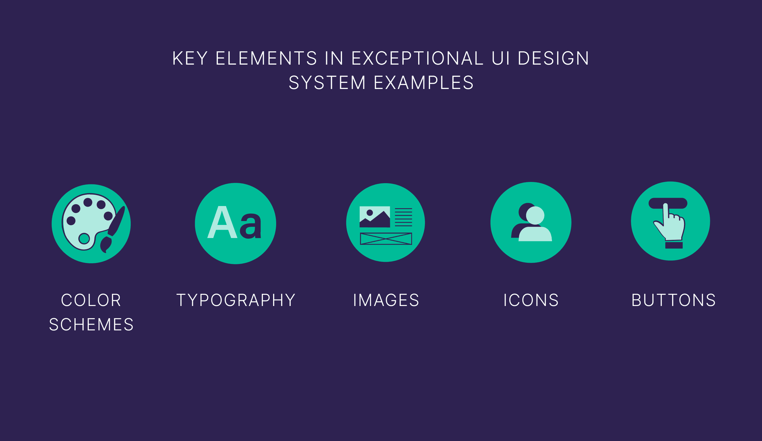
Some key visual elements of UI design include the following:
- Color schemes
- Typography
- Images
- Icons
- Buttons
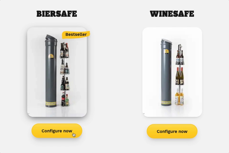
Advanced UI design includes interactive elements.
Such as animations, hover effects, and transitions.
Like this hover animation from beer cooler brand Biersafe:
And this image sequence animation by Apple that moves with web visitors as they scroll:

Interactive elements like these make the shopping experience more enjoyable and engaging.
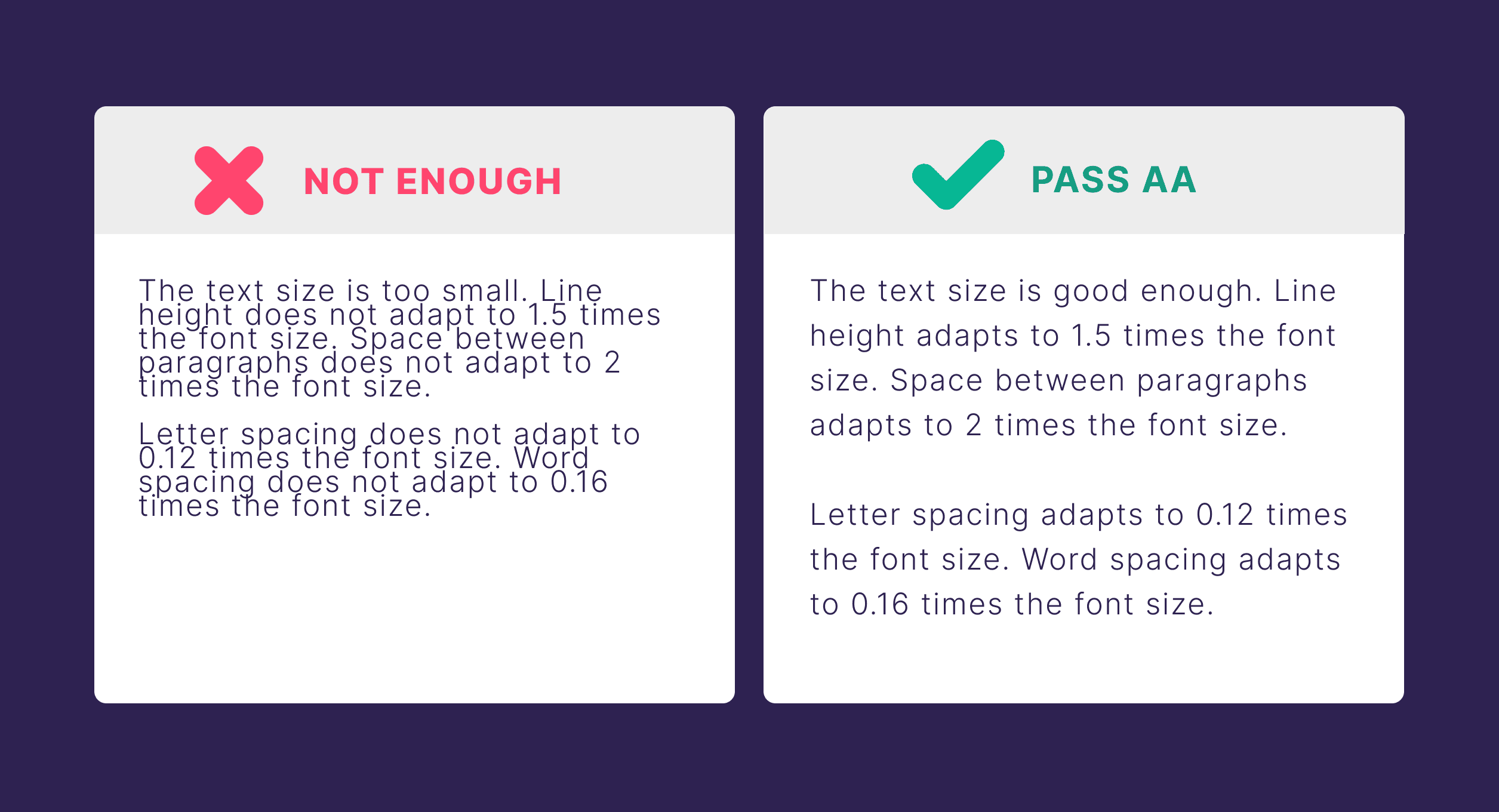
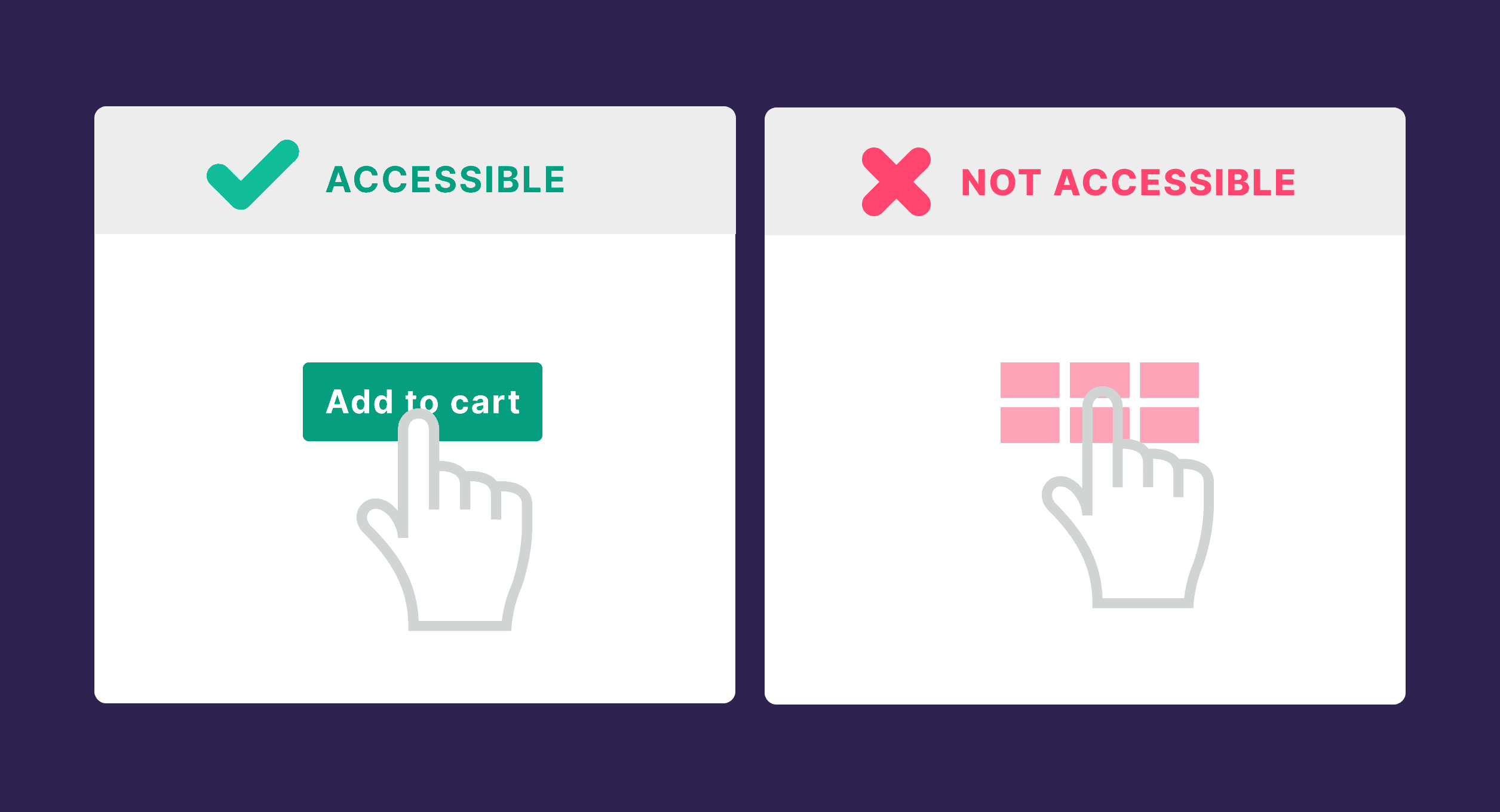
A strong UI also considers accessibility.
It helps ensure that everyone, including those with low vision, can use the site.
This means using clear and readable text between 12 to 14 pixels.
Large buttons that are easy to click:
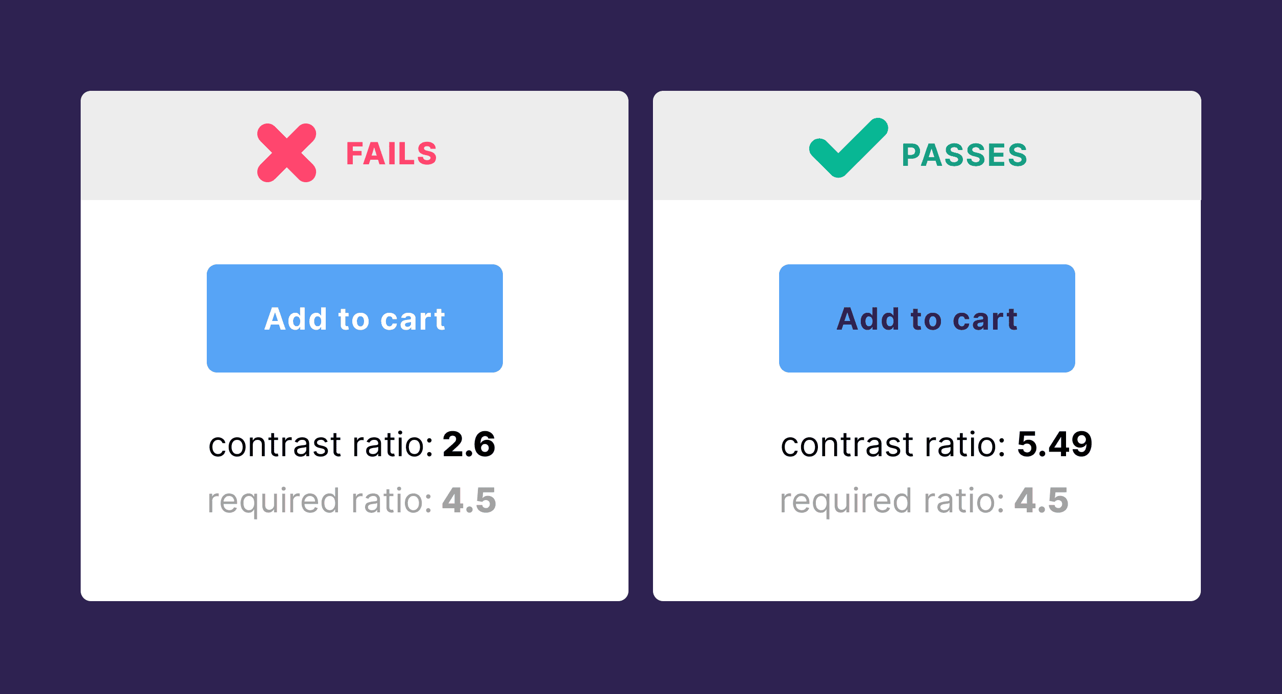
And colors with enough contrast to keep readability high.
2. Mobile Responsiveness
A mobile responsive design means your website automatically adjusts its layout and functionality to provide an optimal viewing experience across all devices.
This provides a fluid and consistent user experience, from desktop to smartphone.
Key components of mobile responsive design include:
- Flexible layouts that adapt to screen size
- Scalable images that resize on different screens without losing quality
- Readable text without having to zoom on smartphones
- Easy-to-use navigation on smaller screens
- Touch-friendly buttons and links
With 57% percent of ecommerce sales coming from mobile devices, a mobile responsive design is a must.
Even more persuasive?
Global mobile ecommerce revenue is projected to surpass 3 billion by 2027.

So, what does mobile responsiveness look like in action?
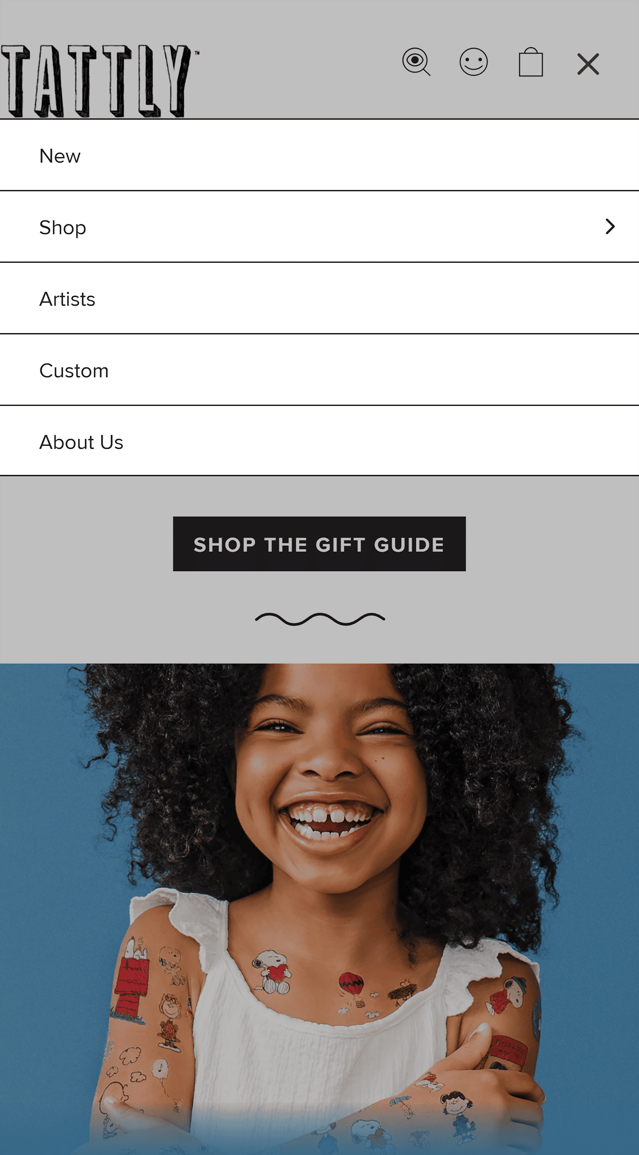
Tattly, an ecommerce site that sells temporary tattoos, provides a seamless experience for its customers, no matter which device they use.
For example, this is what you see when viewing Tattly’s site on a desktop computer:

And this is what you see on mobile:

Notice how Tattly condensed its content and images?
The desktop version shows a grid of six categories, while the mobile version displays categories one by one.
This makes the content easier to browse on smaller screens.
Tattly’s mobile version also uses an expandable “hamburger menu” to save space while keeping all navigation options accessible.
Bottom line?
The design stayed consistent—only the layout changed to fit the mobile screen’s vertical orientation.
No matter how good your products are, if users can’t easily purchase them on mobile, you risk losing sales.
3. Secure and Easy Checkout Process
When checkout is quick, easy, and secure, users are more likely to complete the purchase.
In fact, a whopping 25% of cart abandonments happen because shoppers don’t trust the site with their credit card information.
Long and complicated checkout processes cause 22% of shoppers to abandon their carts.
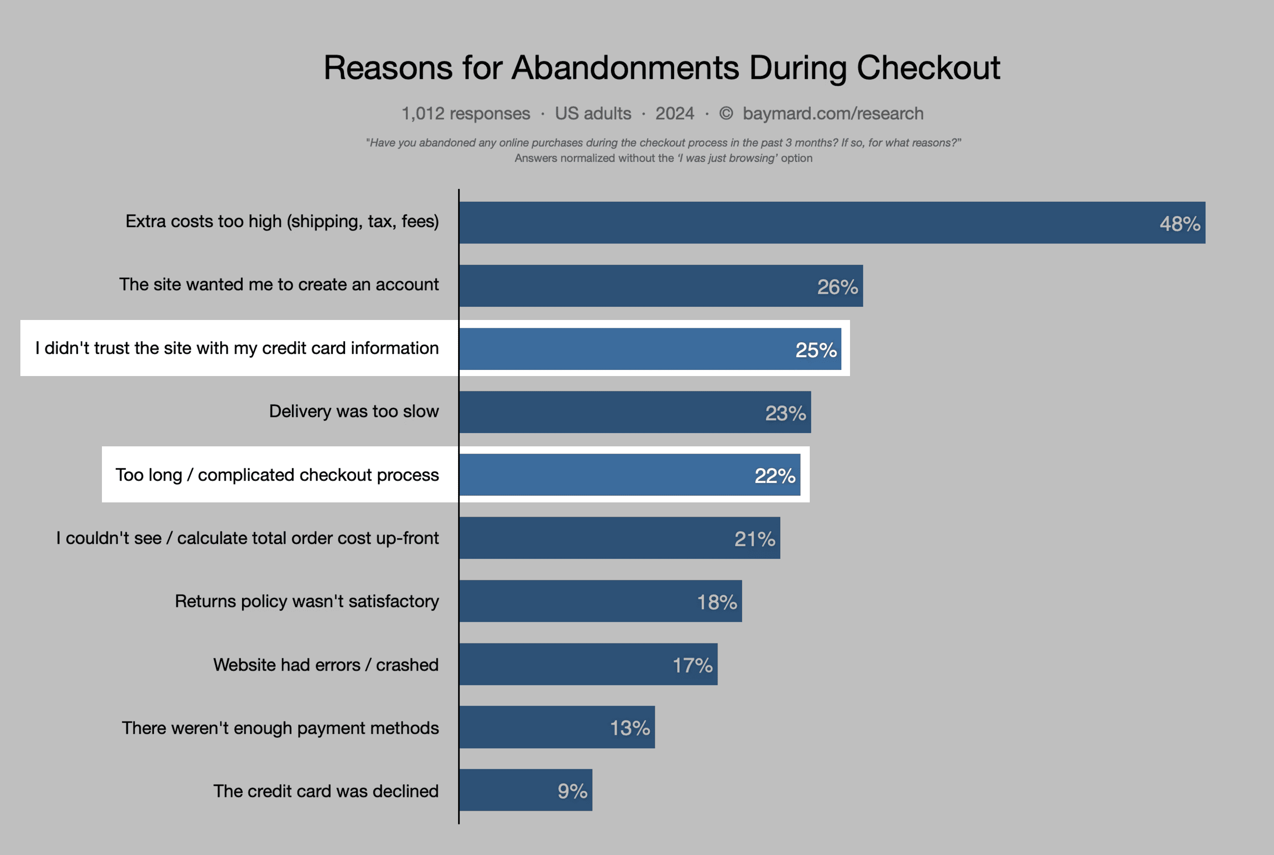
Addressing these issues can help boost your conversion rates.
Let’s look at an example of a user-friendly checkout process.
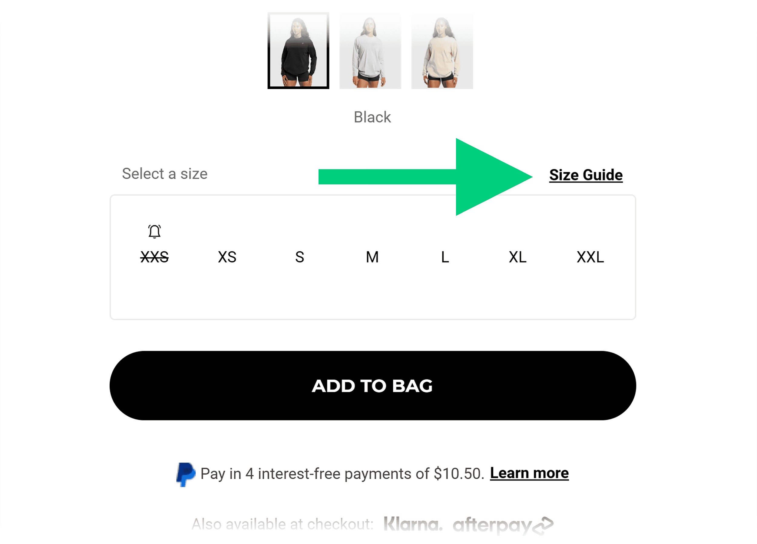
Gymshark, an apparel retailer, provides everything shoppers need to make a purchasing decision on each product page.
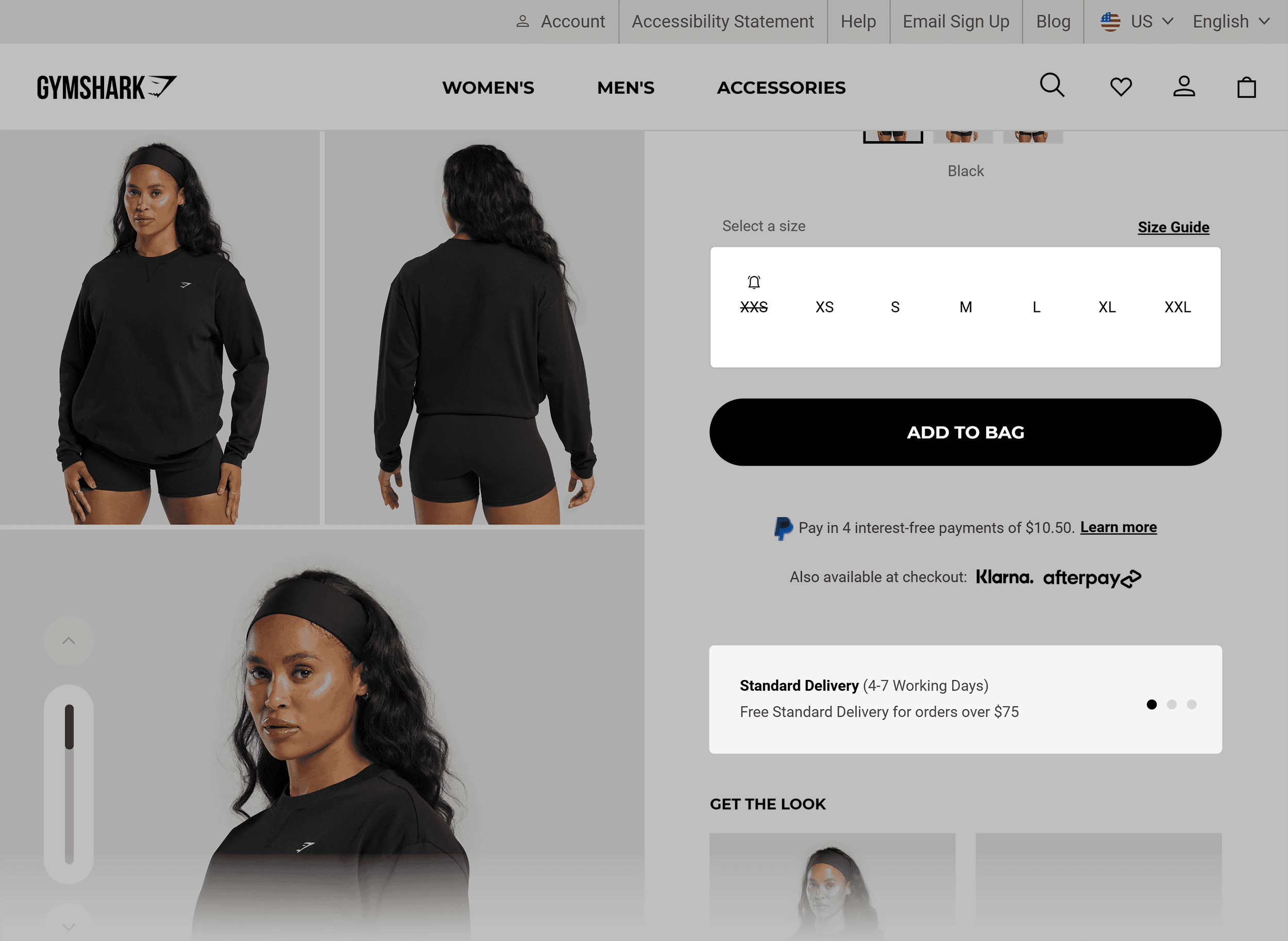
Notice how the size guide is located right next to the size selections?
This makes it easy for shoppers to choose a size without searching the site.
Delivery and return policies are clearly visible on the product page as well:
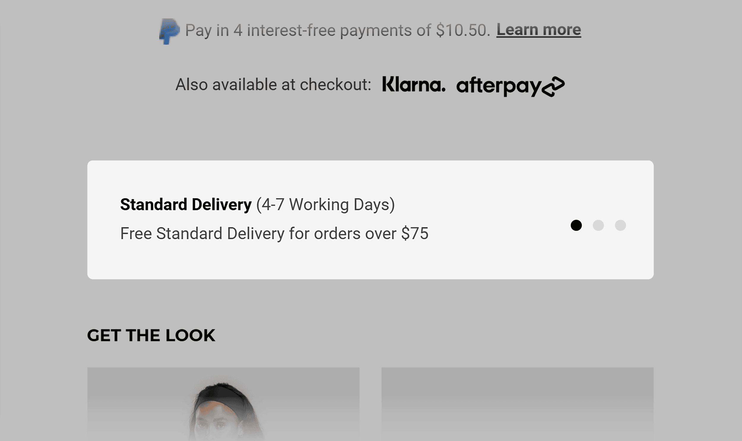
This helps shoppers understand what to expect when they buy from Gymshark.
And gives them the confidence to complete their purchase.
The large “Add to Bag” button is easy for shoppers to spot and takes them to their cart.
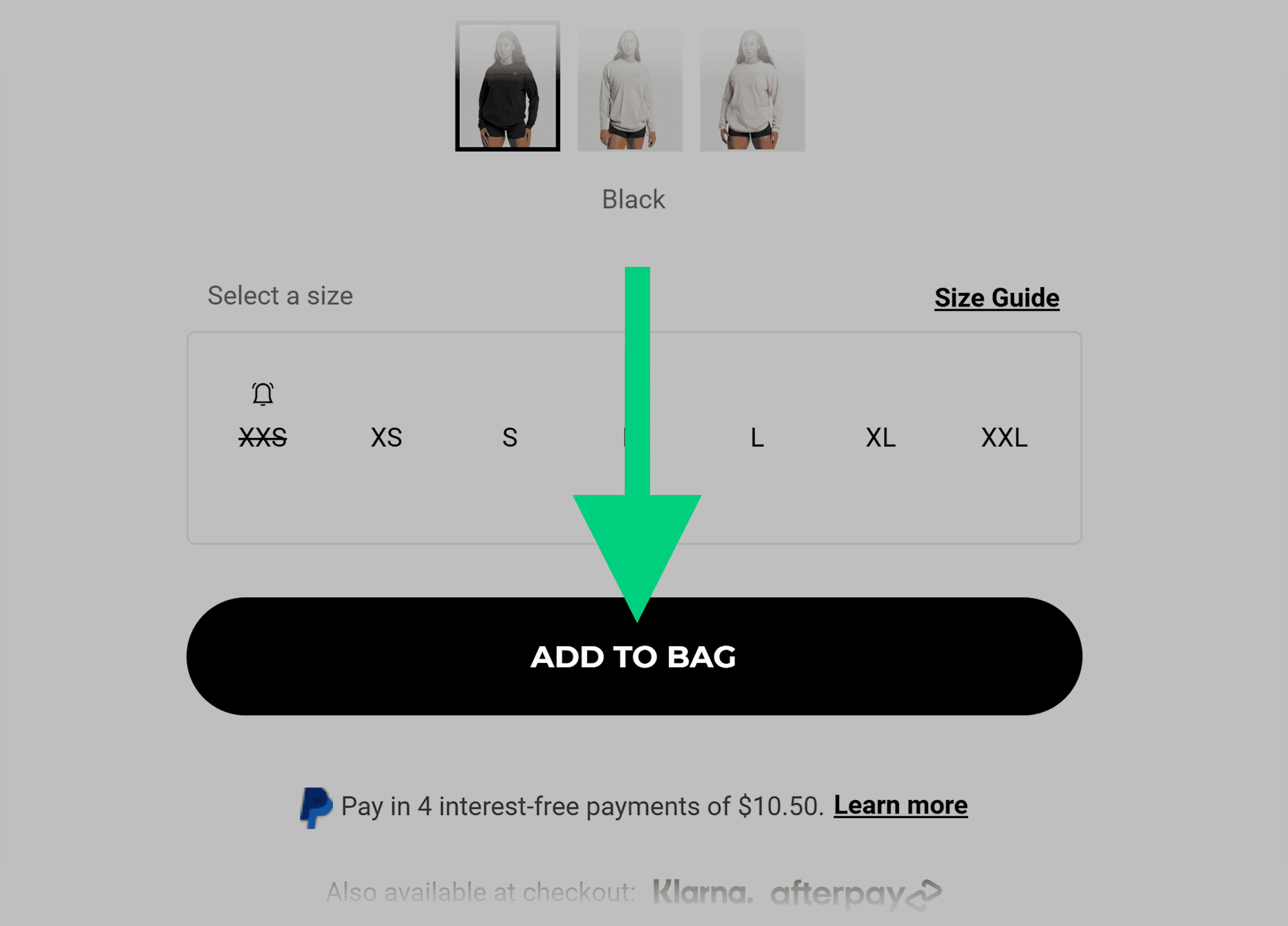
While in their shopping cart, they can remove items, change quantities, or even continue shopping for related items:
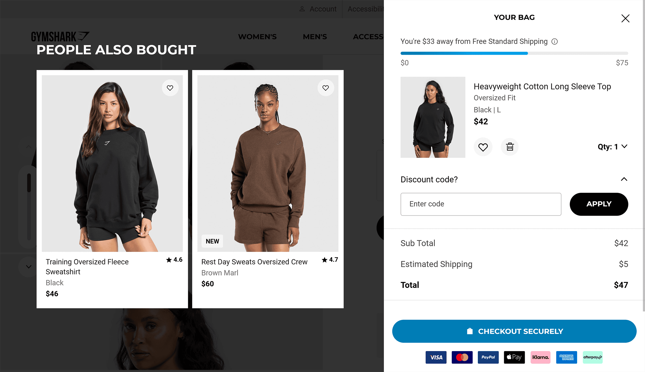
The checkout page makes it seamless to complete the checkout.
There are easy-to-understand fields for important details like shoppers’ addresses, preferred shipping methods, and payment information.
It also clearly shows the total.
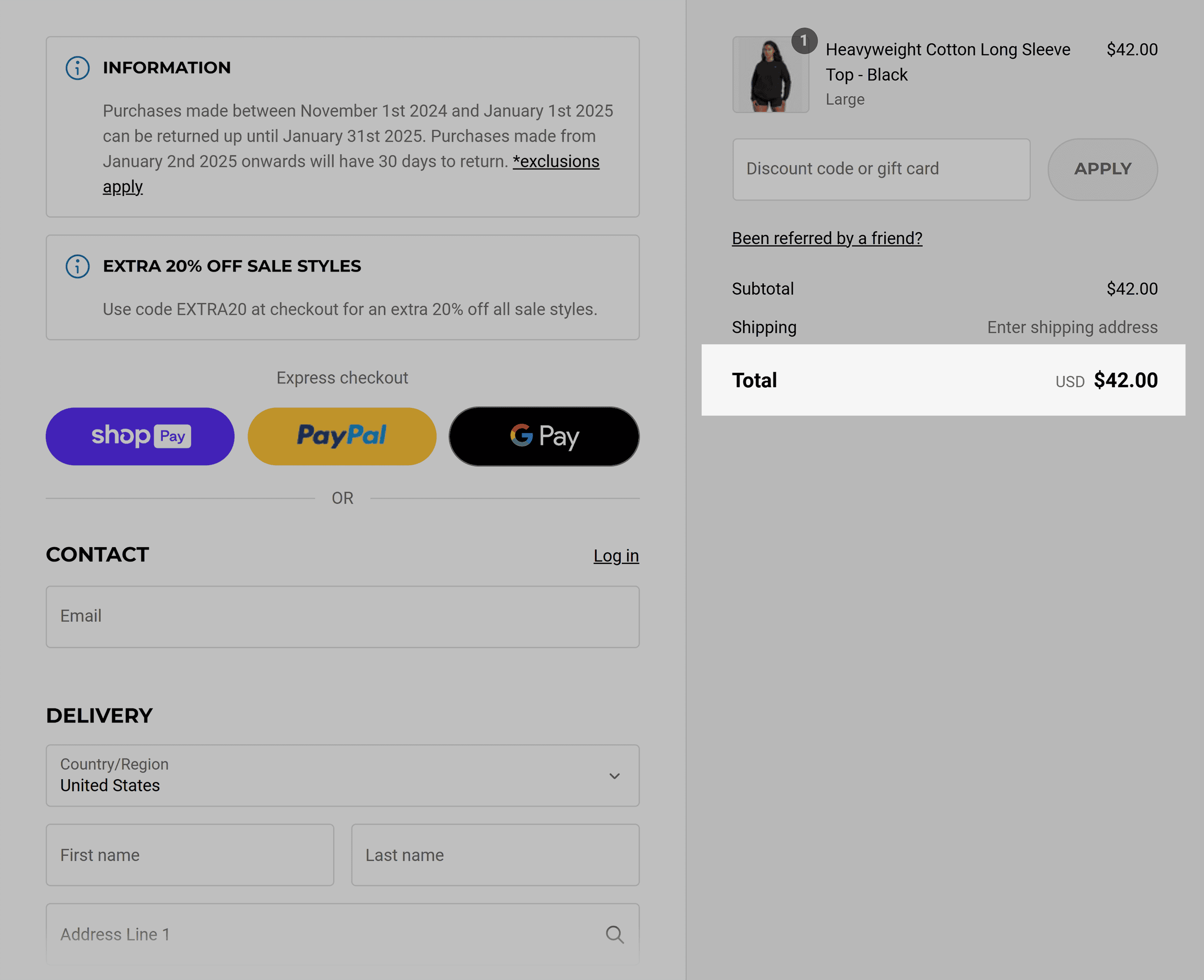
An intuitive checkout process like this adds up to more completed purchases and happier customers.
5 Ecommerce Website Design Best Practices
A great website ecommerce design doesn’t just look good—it builds trust, guides purchases, and keeps customers coming back for more.
Here are five proven design practices you can use to boost sales and create an experience shoppers love.
1. Design a Simple Navigation
A clear, easy-to-use menu will help shoppers find products and information quickly.
When customers can easily locate what they need, they’re less likely to leave your page.
This will reduce your site’s bounce rate and likely increase sales, too.
If possible, start with three to seven main categories in your navigation menu. Too many options can overwhelm shoppers.
Use clear, descriptive labels for each category, such as “Product Info,” “My Account,” and “Company.”
Here’s a navigation example from the furniture store Terra Outdoor that ticks all the boxes:
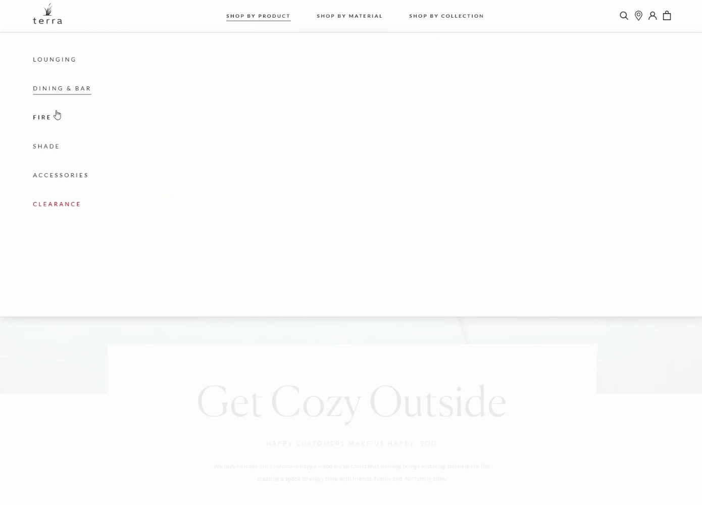
What do they do right?
- Clean drop-down navigation menu that allows shoppers to browse products easily
- Items organized by product groups, materials, and collections
- Products are sorted into subcategories when a user clicks on a category
The result?
Over 148K shoppers visit the site each month. The bounce rate of just 11.22% shows users are sticking around to engage with Terra Outdoor’s pages.

Clearly, the site was designed to attract, convert, and retain shoppers.
But here’s the thing: your navigation can be different. Just make it work for your shoppers.
2. Provide Filtering Options
Filtering options help shoppers quickly find products that fit their taste.
Requiring shoppers to scroll through countless pages to find a specific product can quickly cause you to lose the sale.
Here’s what to keep in mind when implementing filtering in your ecommerce website design:
- Include basic categories like product type
- Let shoppers filter products by color and size
- Add an option to filter products by price
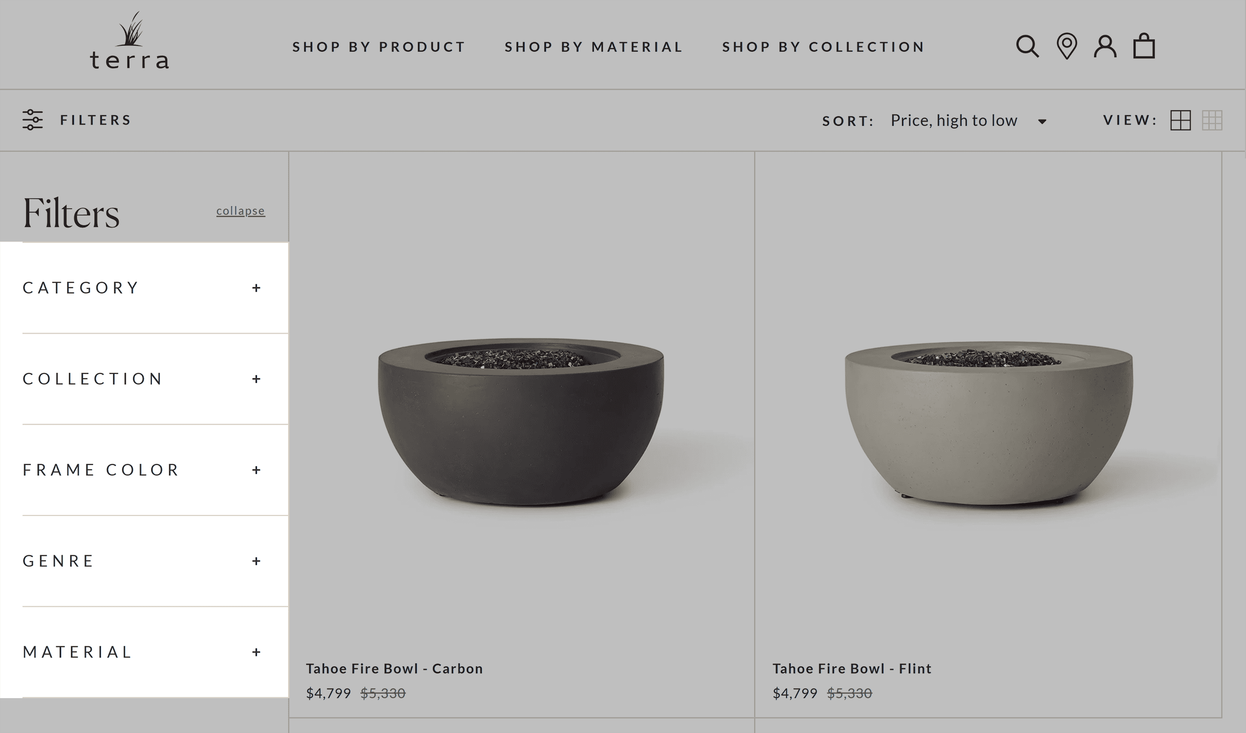
For example, Terra Outdoor lets you filter products by category, collection, color, and material.
3. Use High-Quality Visuals and Product Images
Think about the last time you shopped online. What caught your attention first?
Probably the product images, right?
Great product photos build trust and show shoppers exactly what they’re getting.

The best part? You don’t need expensive photography gear.
A smartphone camera can capture compelling product shots if you follow these tips:
- Showcase products from multiple angles—front, back, side, and close-up shots
- Use lifestyle images to help customers imagine the item in their own space
- Maintain consistency by keeping lighting and style fluid across images
- Make sure the images adapt to different screens (mobile, tablet, and desktop)
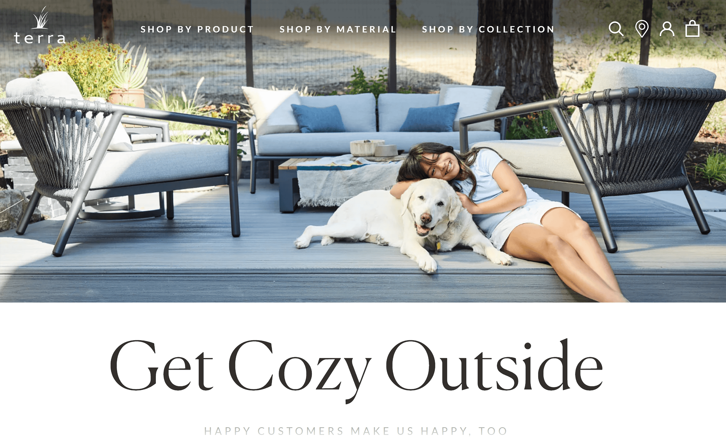
For example, Terra Outdoors features real-life photos throughout the site.
This helps shoppers imagine how the furniture would look in their own space.
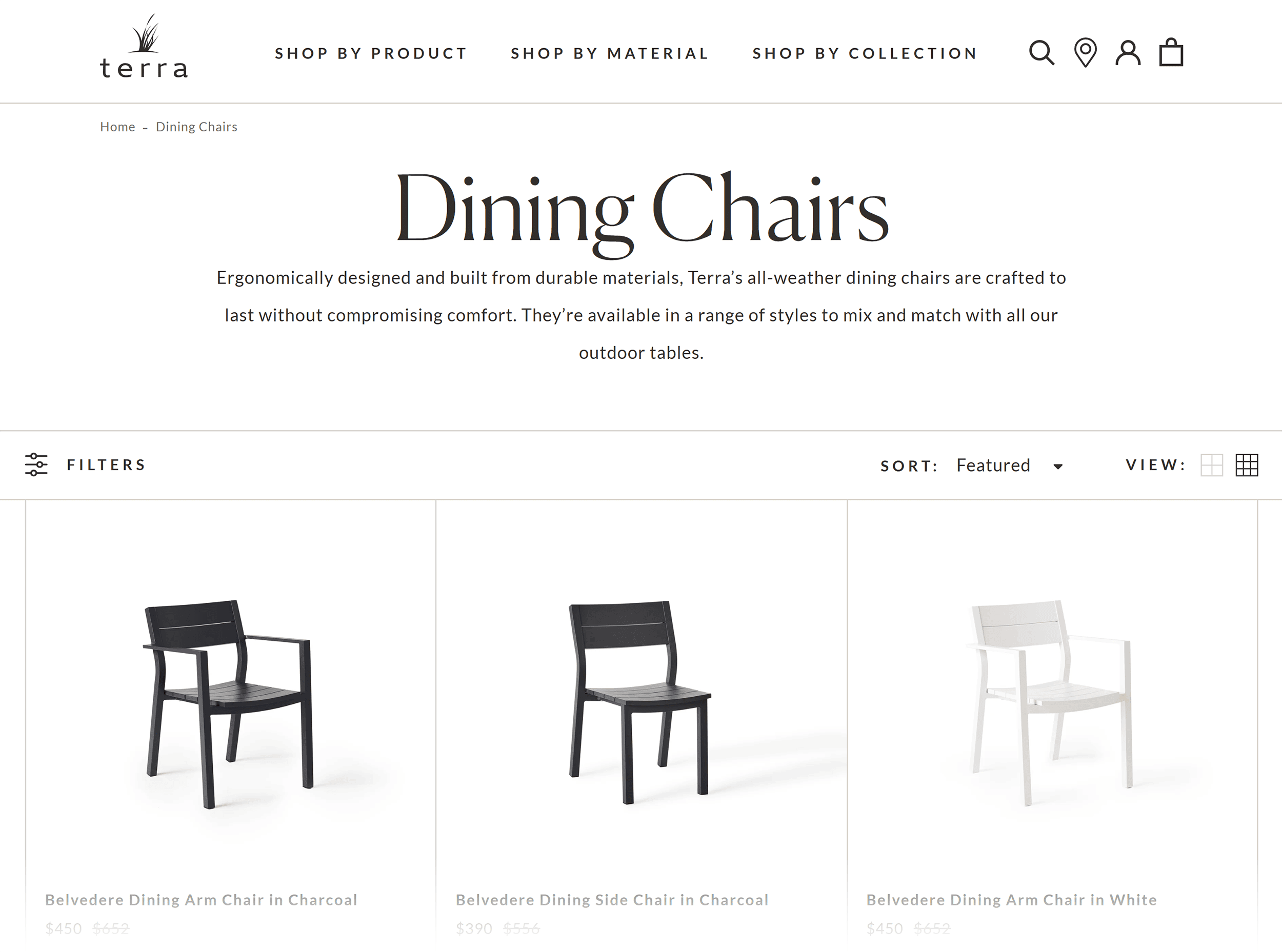
The company also uses simple, high-quality images on its product pages so nothing distracts the shopper from adding to their cart.
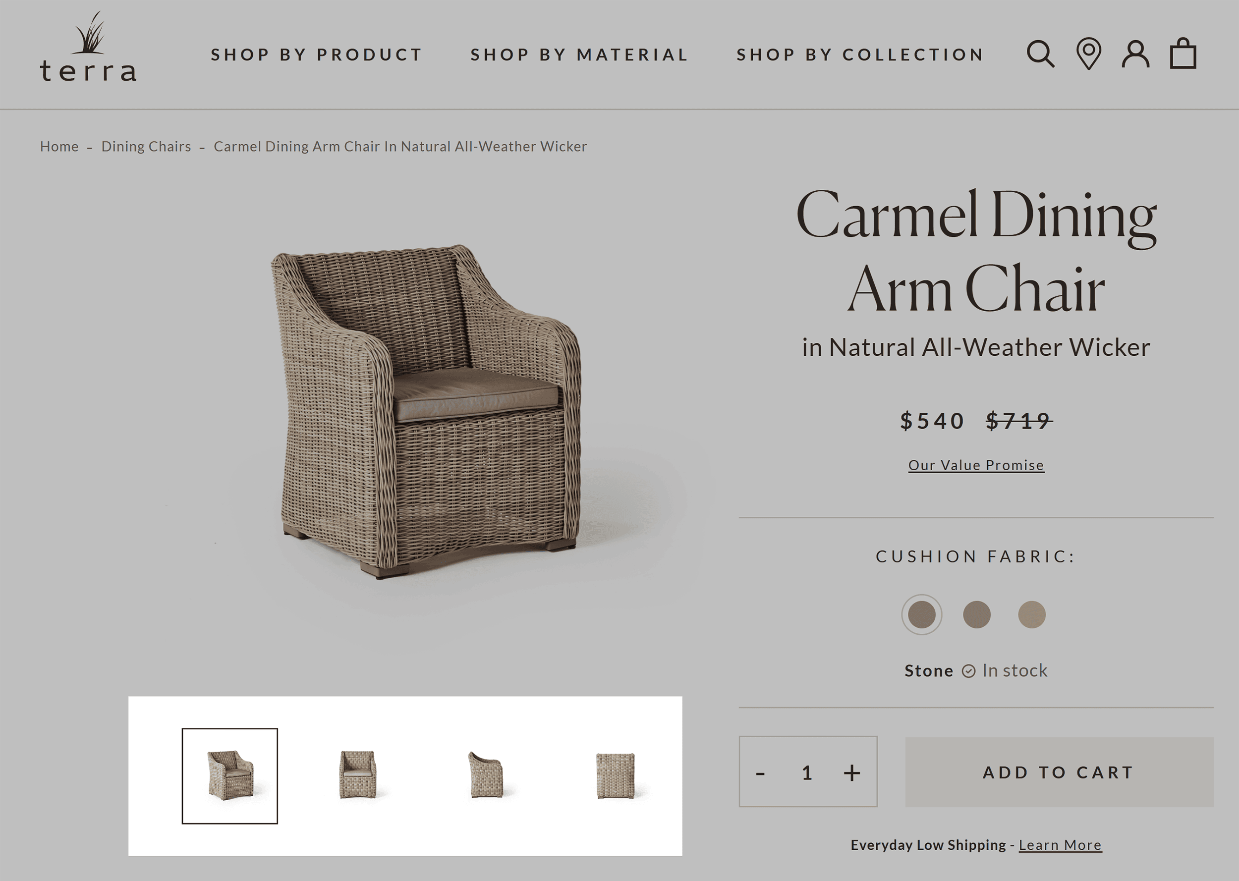
They also show their products from multiple angles.
So, shoppers see exactly what they’re buying, which means no surprises when the package arrives.
4. Create Compelling Call to Action (CTA) Buttons
Ever noticed those “Buy Now” or “Add to Cart” buttons that seem to jump off the page?
Those are CTA buttons.
A great CTA stands out instantly and tells shoppers exactly what to do next.
Like this:
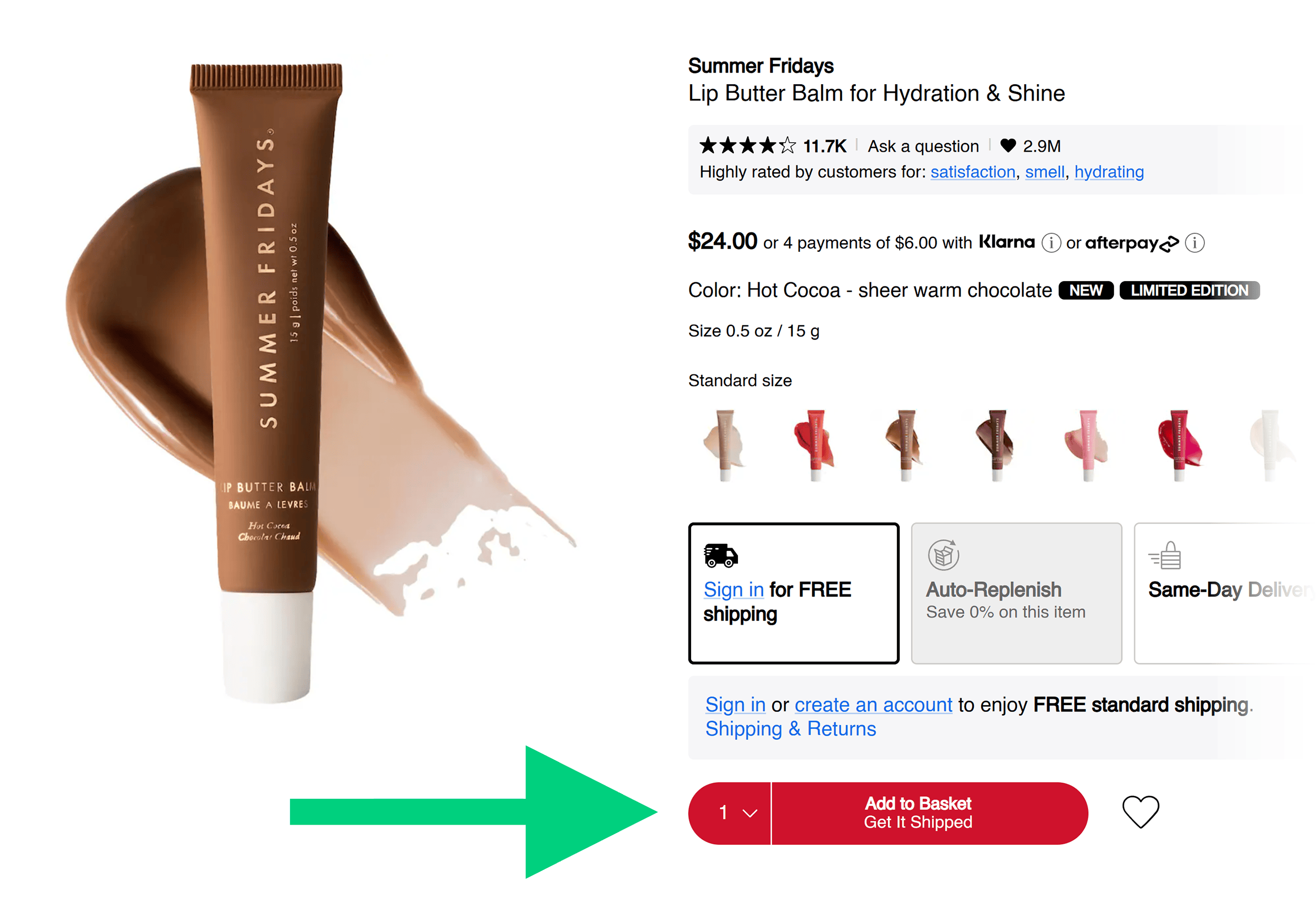
Create a persuasive CTA by using a contrasting (yet complementary) color.
Design multiple versions with different colors and phrases so you can A/B test them to see which performs best with your audience.
White Stuff, an apparel store, has a simple yet effective CTA that shoppers can easily see without having to scroll or search for it.
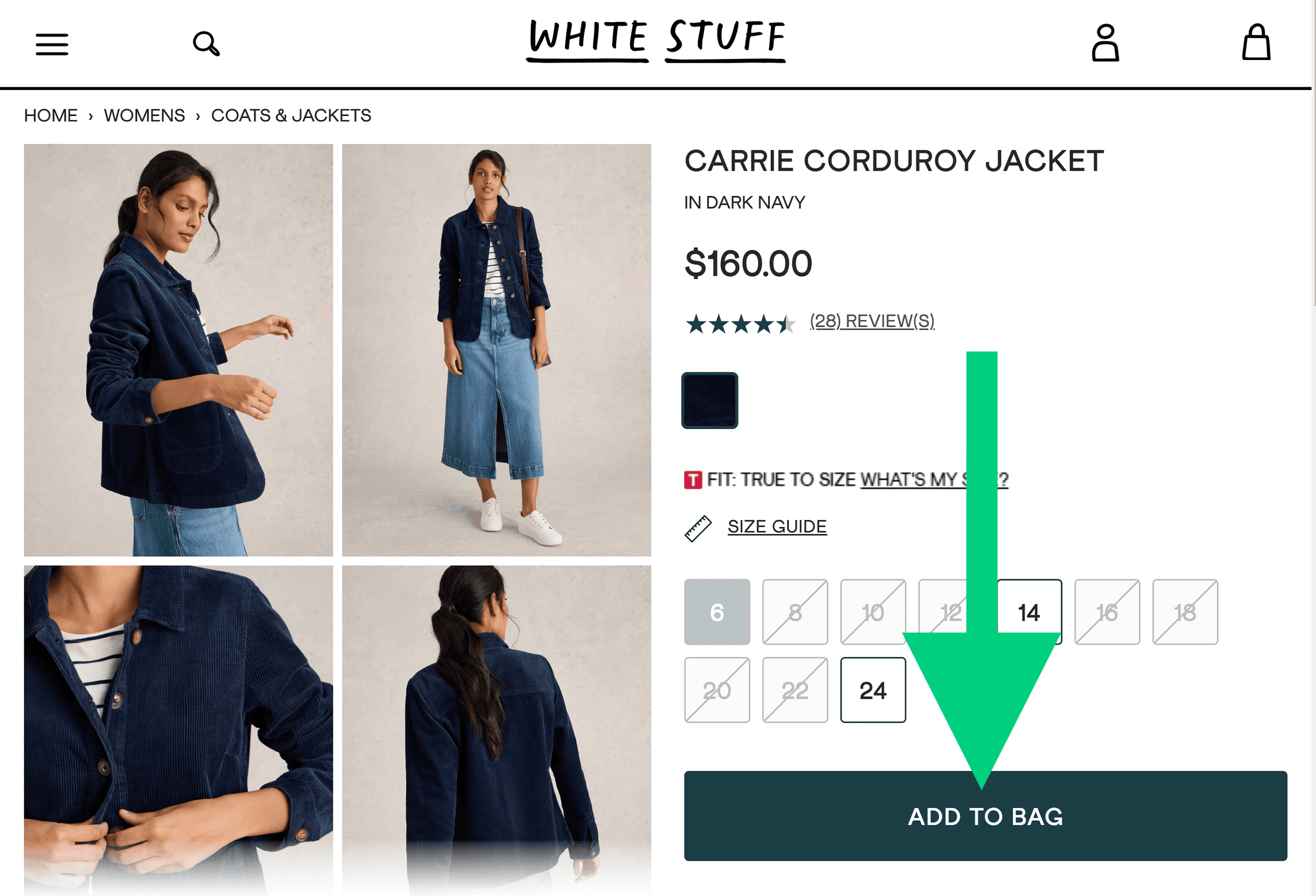
The button is large enough to grab attention.
And the color sharply contrasts against the background and text.
All these factors make it easy for customers to complete the purchase.
5. Incorporate Social Proof
Social proof, such as customer reviews and ratings, builds trust and increases conversions.
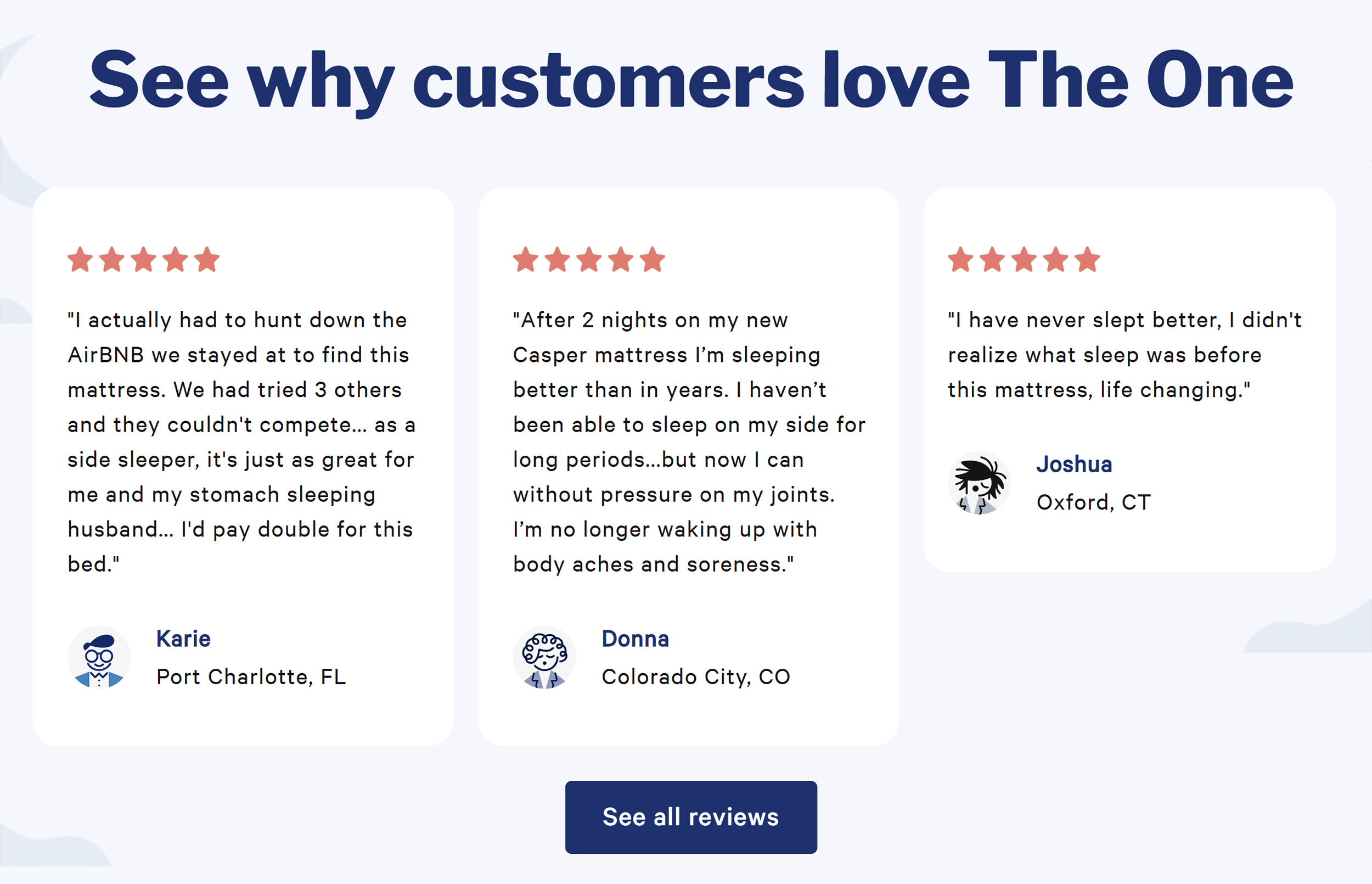
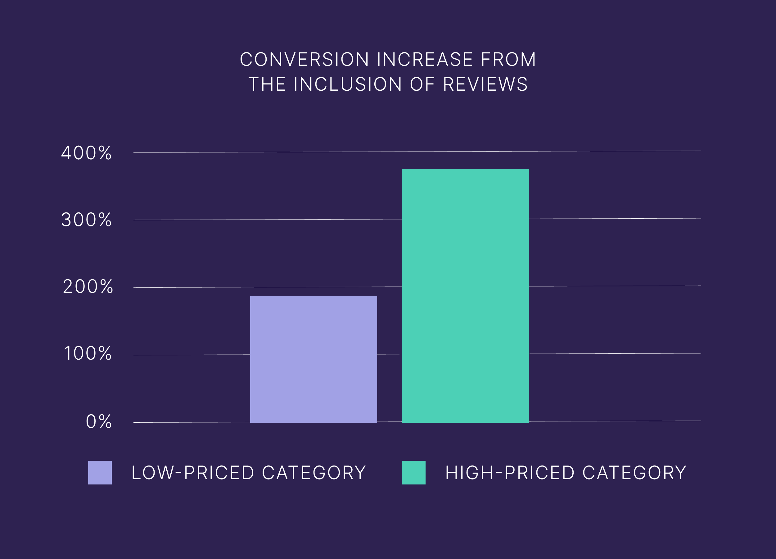
In fact, products with five reviews have a 270% higher purchase likelihood compared to products with no reviews.
For higher-priced products, the conversion rate gets even higher—380%.
Why does it work so well?
Because you’re using past customers’ experiences to influence potential buyers’ decisions.
Pet product retailer Chewy includes reviews on all product pages and provides shoppers with filtering options.
This includes star rating, “most relevant,” “highest rated,” and more.
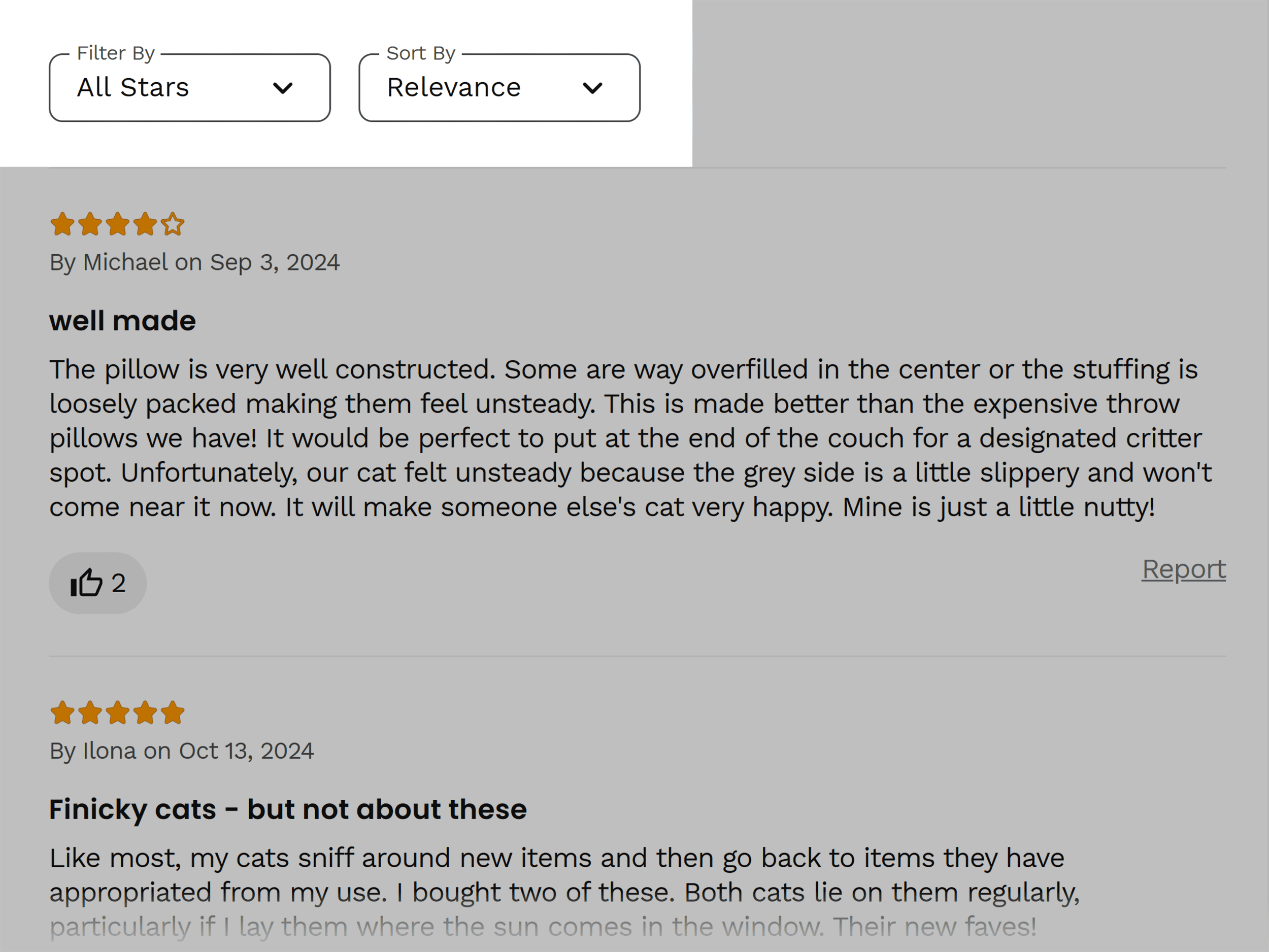
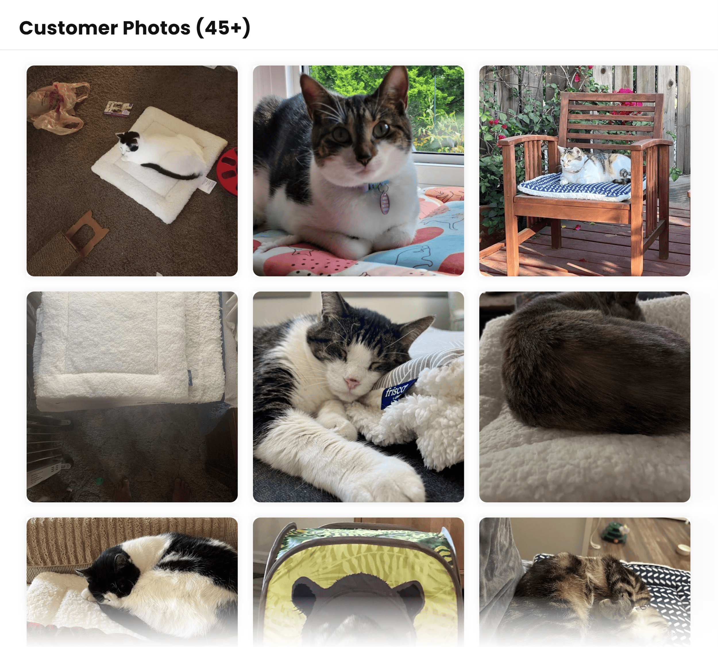
Chewy also lets reviewers add photos, which can be a persuasive way to encourage shoppers to complete a purchase.
(Nothing sells a cat bed better than seeing real kitties sleeping happily in it.)
How can you implement social proof into your ecommerce website design?
Integrate review tools like Yotpo on your ecommerce website to allow shoppers to easily leave reviews after purchasing.
Send a follow-up email to customers after they receive their purchase, asking them to share their experience with your brand.
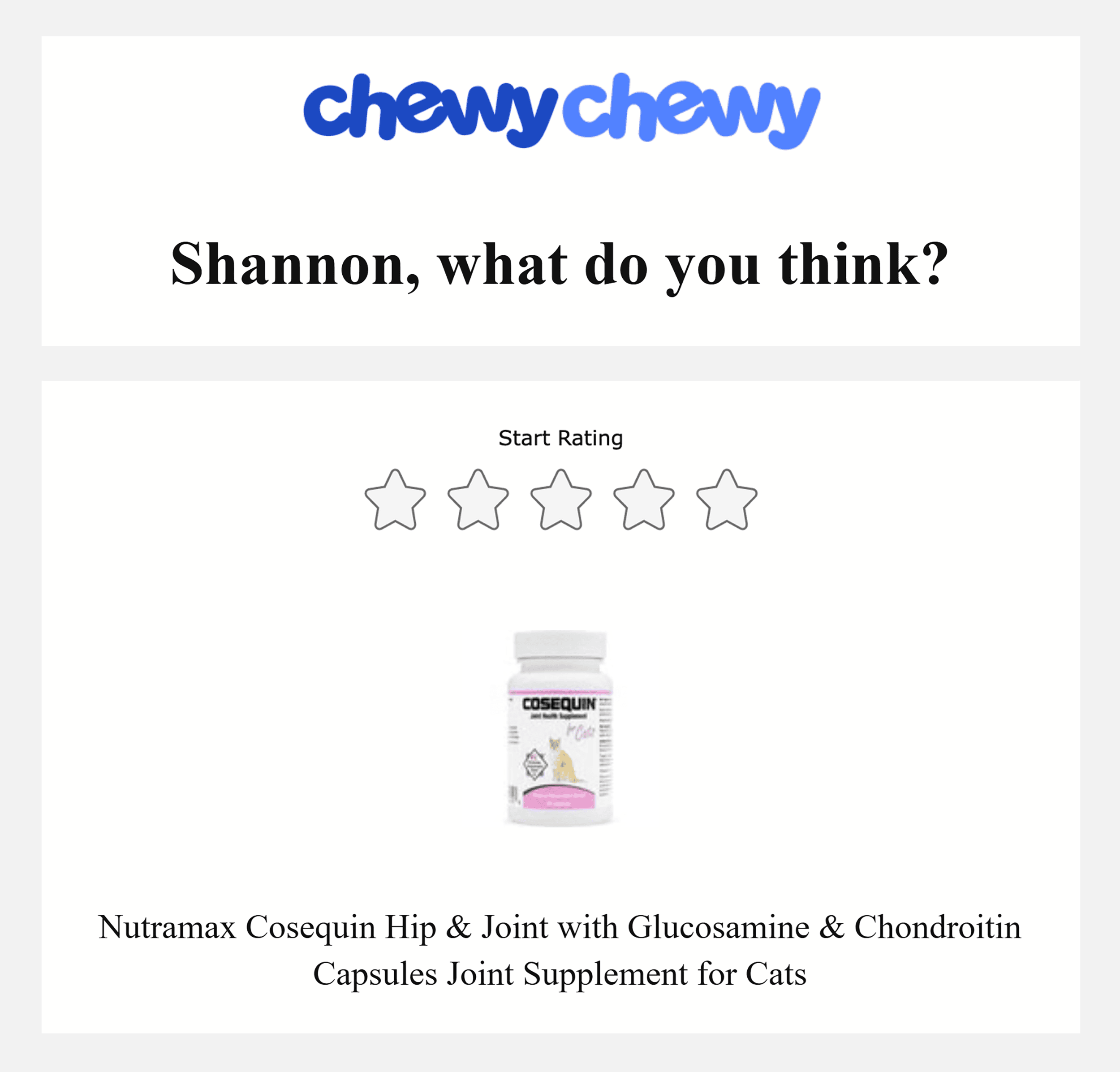
Include a direct link in the email that makes it easy for them to leave a review.
SEO Considerations for Your Ecommerce Website
Website design isn’t just about looks. It’s about building a store that both shoppers AND search engines love.
Enter: Search engine optimization (SEO).
Here’s how SEO can work with your site’s design to create an optimal experience:
- Site structure helps search engines crawl and navigate your store
- Clear product page structures and meta tags help search engines understand what you’re selling
- Proper image tags help search engines see your products
- Search engines like Google favor pages that load fast
Let’s explore how to optimize your ecommerce website design for better search visibility while maintaining a great user experience.
Optimize H1 Tags
An H1 tag is the main heading on your webpage. It’s the largest text on the page.
Like this:
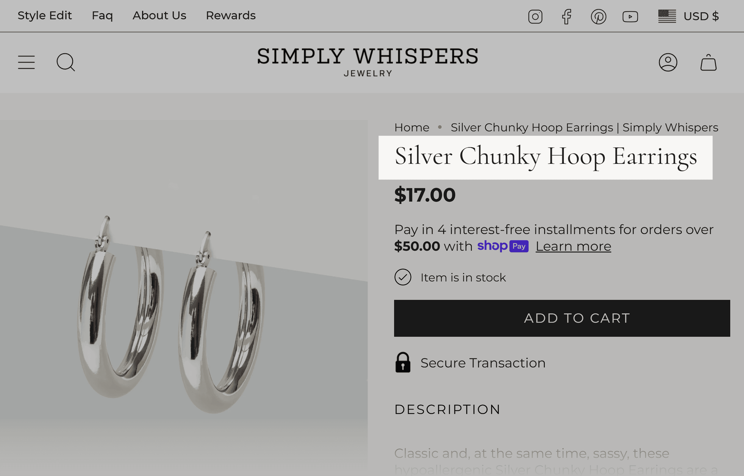
The H1 tag is more than a design element.
It tells search engines what each page is about. It also gives users a clear idea of your page’s content at a glance.
Follow these best practices for incorporating H1s into your pages:
- Use one H1 per page
- Include a target keyword that best describes your product
- Make it descriptive of your page content
- Keep it concise
How do you find the right keywords?
One way is to brainstorm the phrases your audience might use to find your product.
A more data-driven approach is to use Semrush’s Keyword Magic Tool.
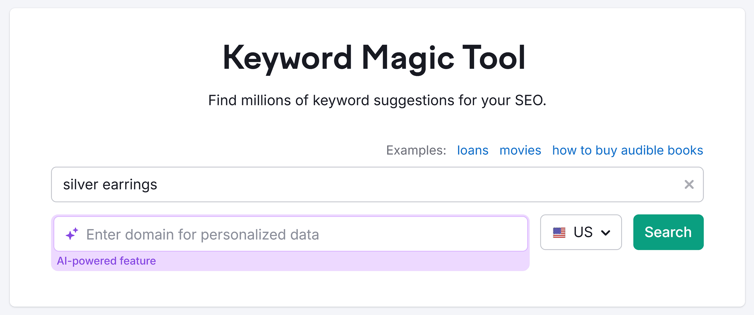
Start by entering a generic phrase related to your product in the tool.
Let’s say you sell jewelry and one of your product categories is silver earrings. Enter “silver earrings” in the tool and click “Search:t”
The tool will return a list of keywords.
You’ll also see how difficult it is to rank for each keyword.
The lower the keyword difficulty (KD) percentage, the easier it is to rank.
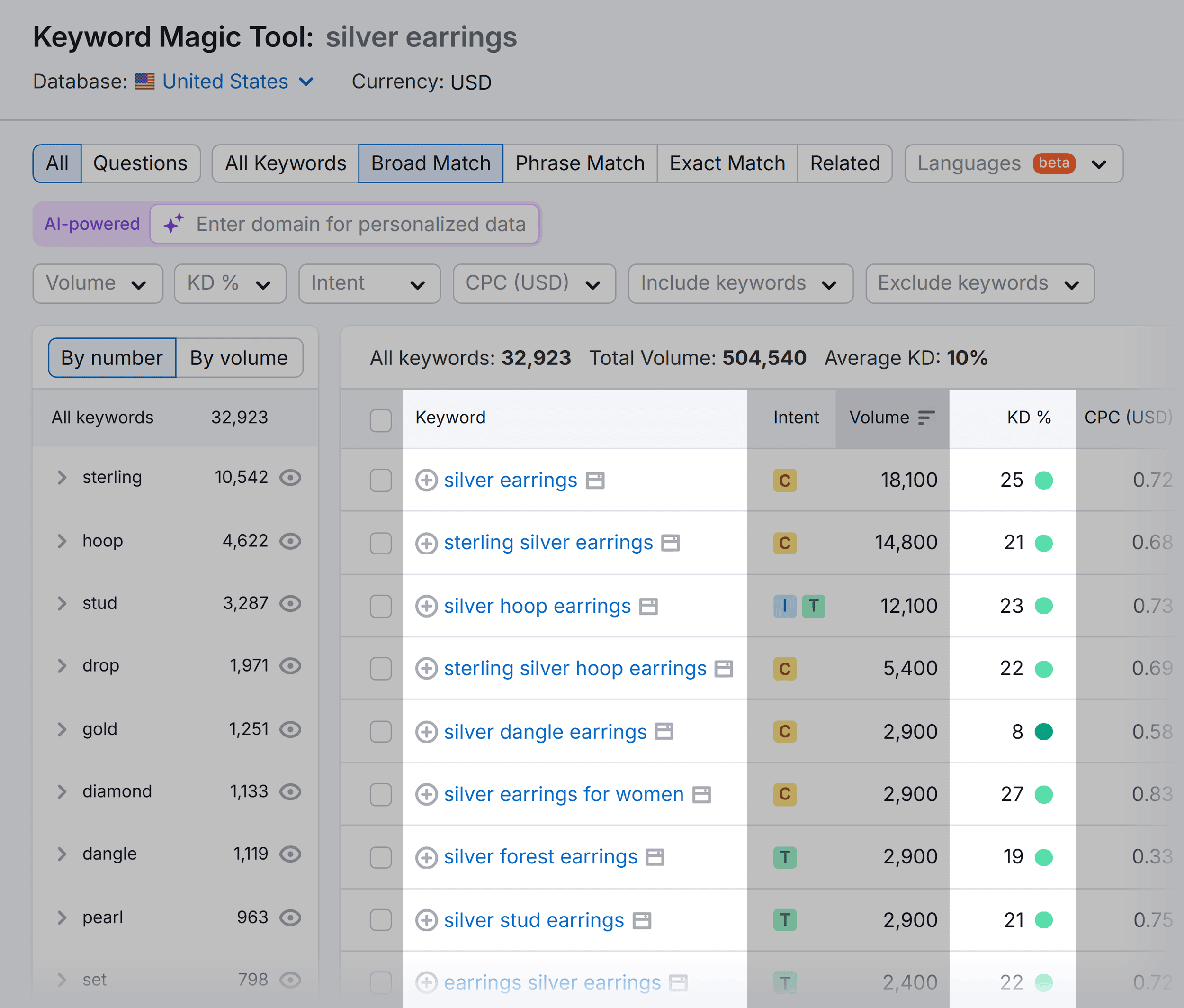
Save the most relevant keywords to use in your H1 tags.
Add Alt Text for Images
Alt text helps search engines understand your images and makes your site more accessible to users.
- Describe your image accurately
- Include a relevant keyword naturally
- Be specific about product details
For example, instead of just “earrings” or “silver earrings,” use: “large silver hoop earrings with polished finish.”
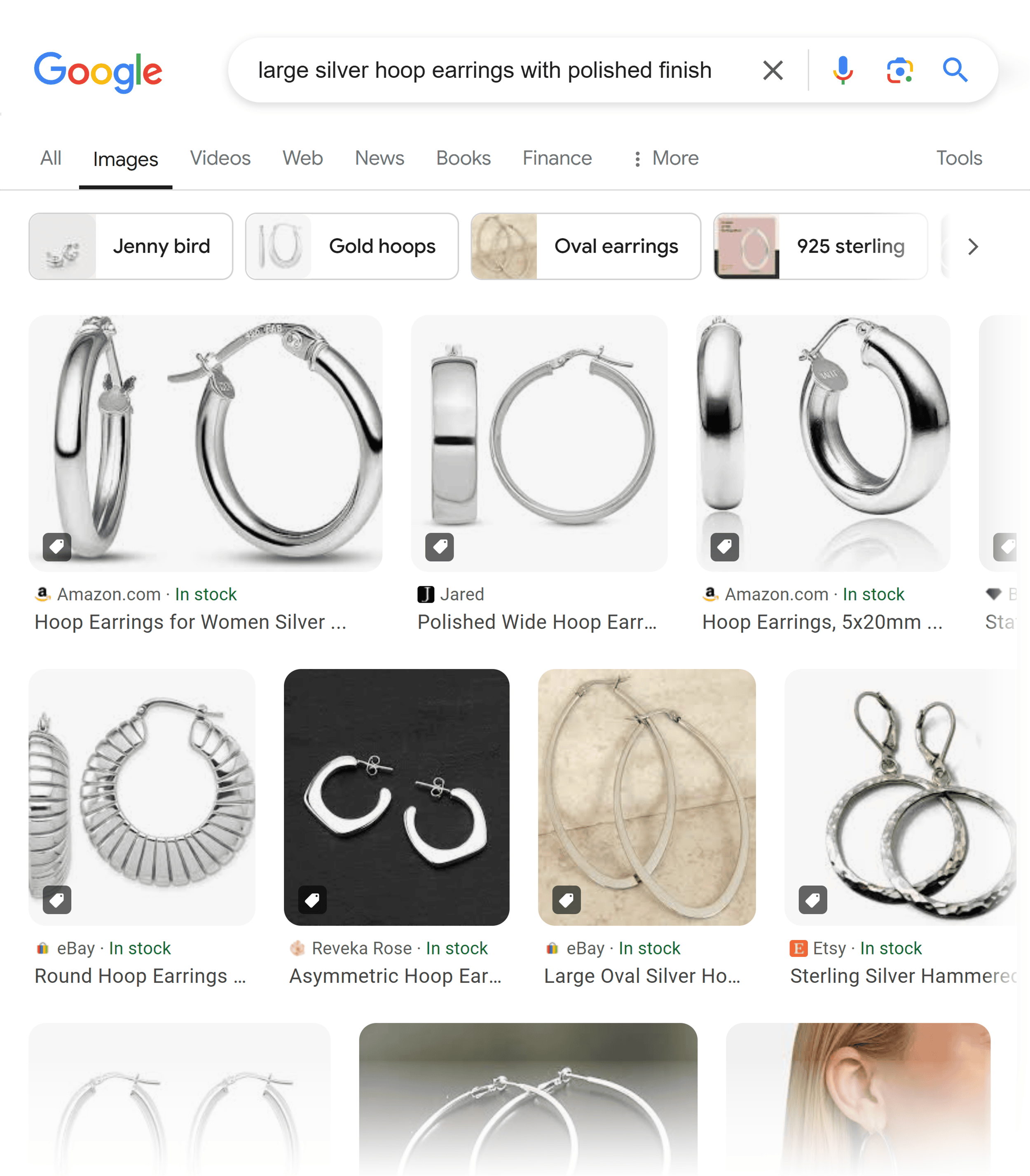
This detailed description makes it easier for potential customers to find exactly what they want.
Improve Page Speed
High-quality visuals are a vital element of ecommerce website design—just ensure they don’t slow down your website.
As page load time goes from one second to three seconds, the probability of users bouncing increases by 32%.
This is why it’s essential to compress images and text.
This is something Agrofy, an agricultural marketplace, knows firsthand.
It reduced its cart abandonment rate by 76% after optimizing the site’s page speed.
And their cart abandonment rate dropped from 3.8% to just 0.9%.
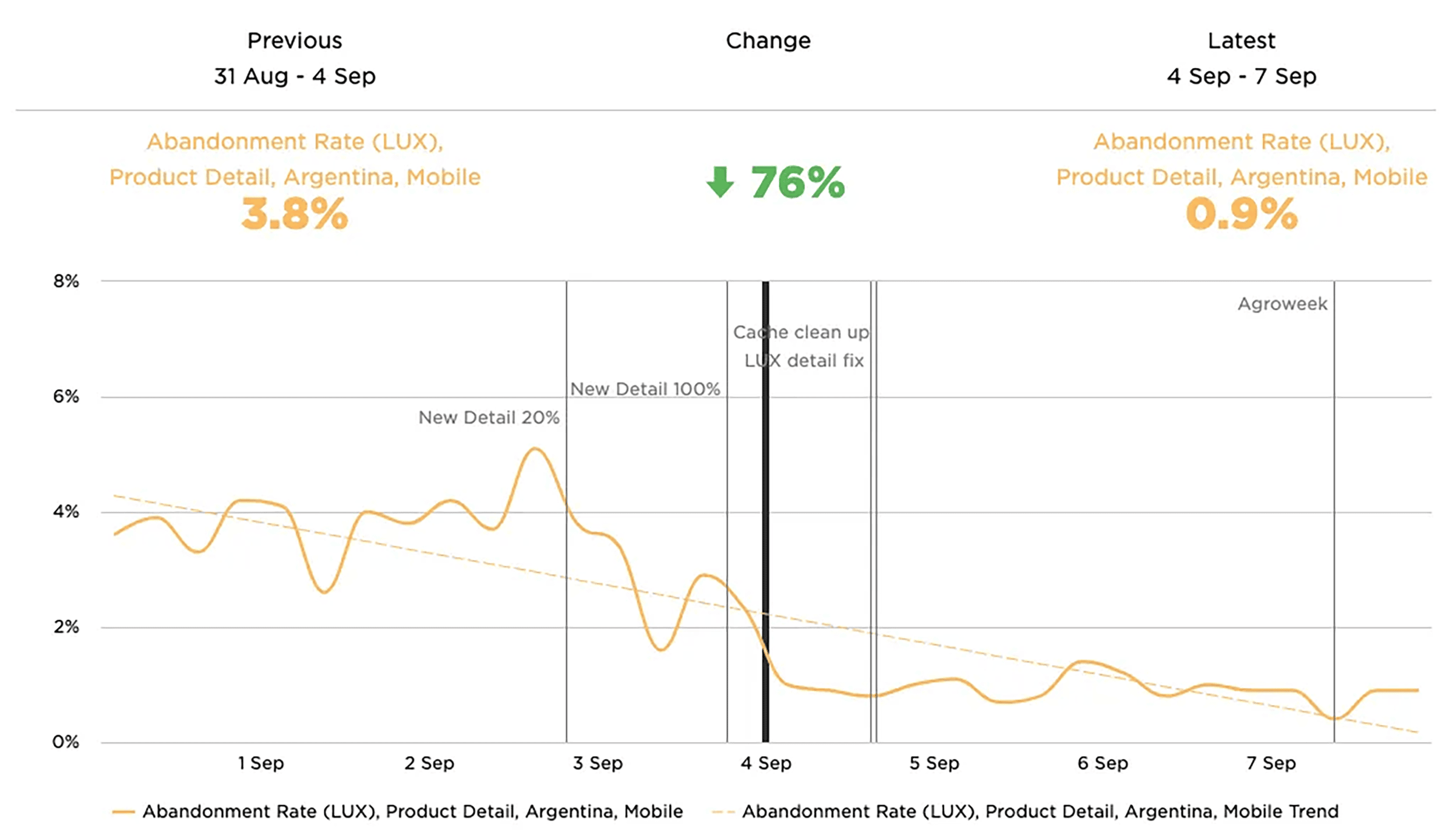
Why did this happen?
Content loaded faster when shoppers landed on Agrofy’s website. So, fewer visitors got frustrated and left the site.
Optimize Title Tags and Meta Descriptions
While not visible on your site itself, title tags and meta descriptions are key on-page SEO elements that show up when prospective customers search for what you sell.
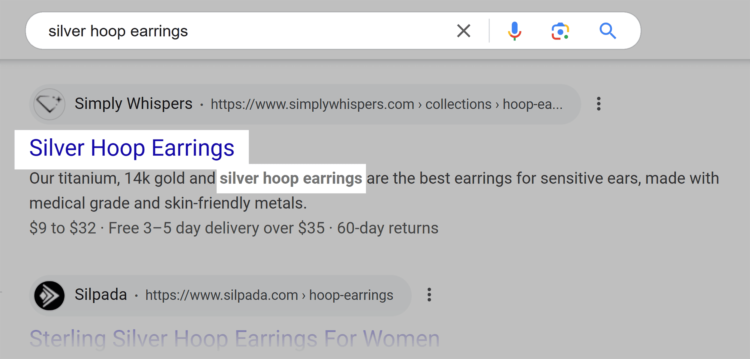
These elements help Google and searchers understand what your page is about.
- Title tags: The clickable headline shown in search results. Keep it under 60 characters, include your keyword, and match your page content.
- Meta descriptions: The preview text under your title in search results. Keep it under 155 characters and make it compelling enough to click.
3 Stunning Ecommerce Websites That Will Inspire You
The fastest way to improve your ecommerce design is to learn from successful stores. These three brands have turned smart design decisions into measurable growth.
Yeti Cycles
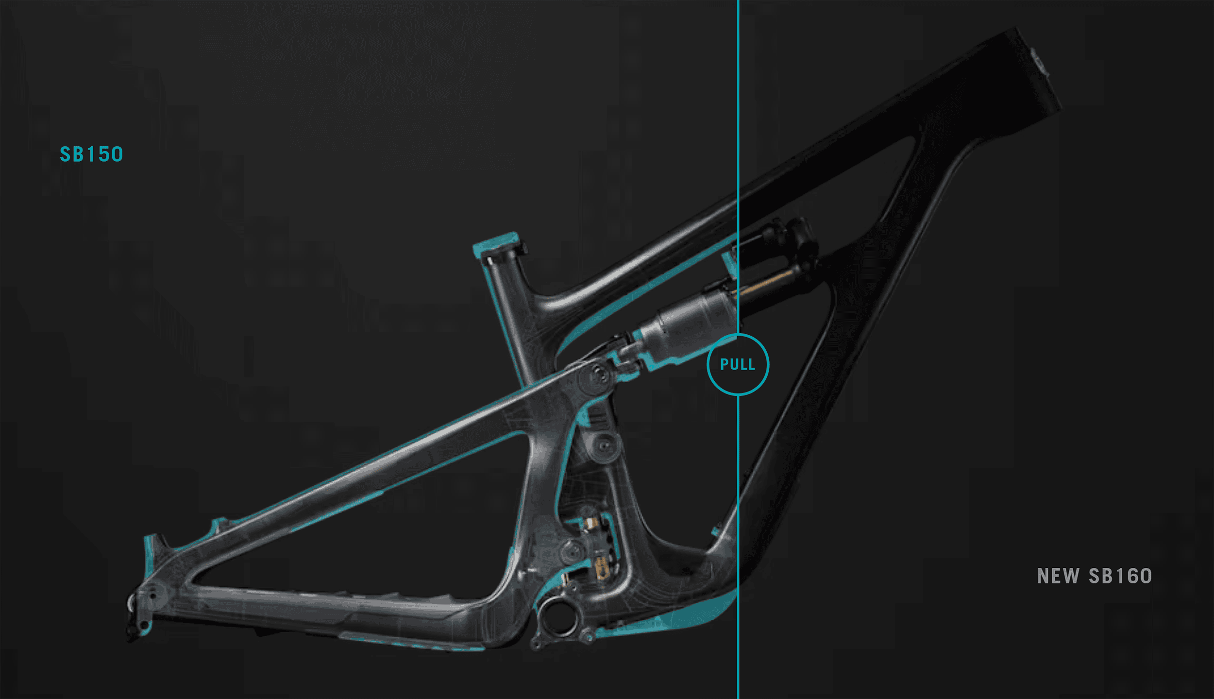
Yeti Cycles uses a creative way to showcase its bikes.
The design is bold and immersive, with colorful, high-quality images that pop on a black background.
As the user scrolls down each page, it creates a magazine-like feel that draws them in.
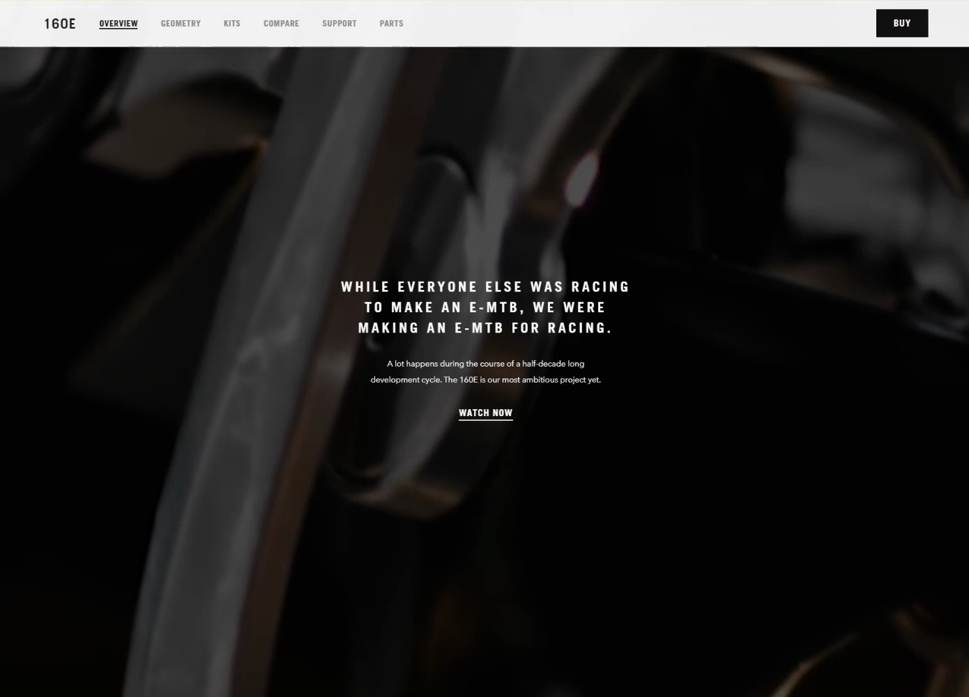
Product description details are revealed as the user scrolls, helping to prevent them from getting distracted.
Animations and interactive elements are also used throughout the site to guide users’ attention, highlight key product features, and create a more engaging shopping experience.
Finn
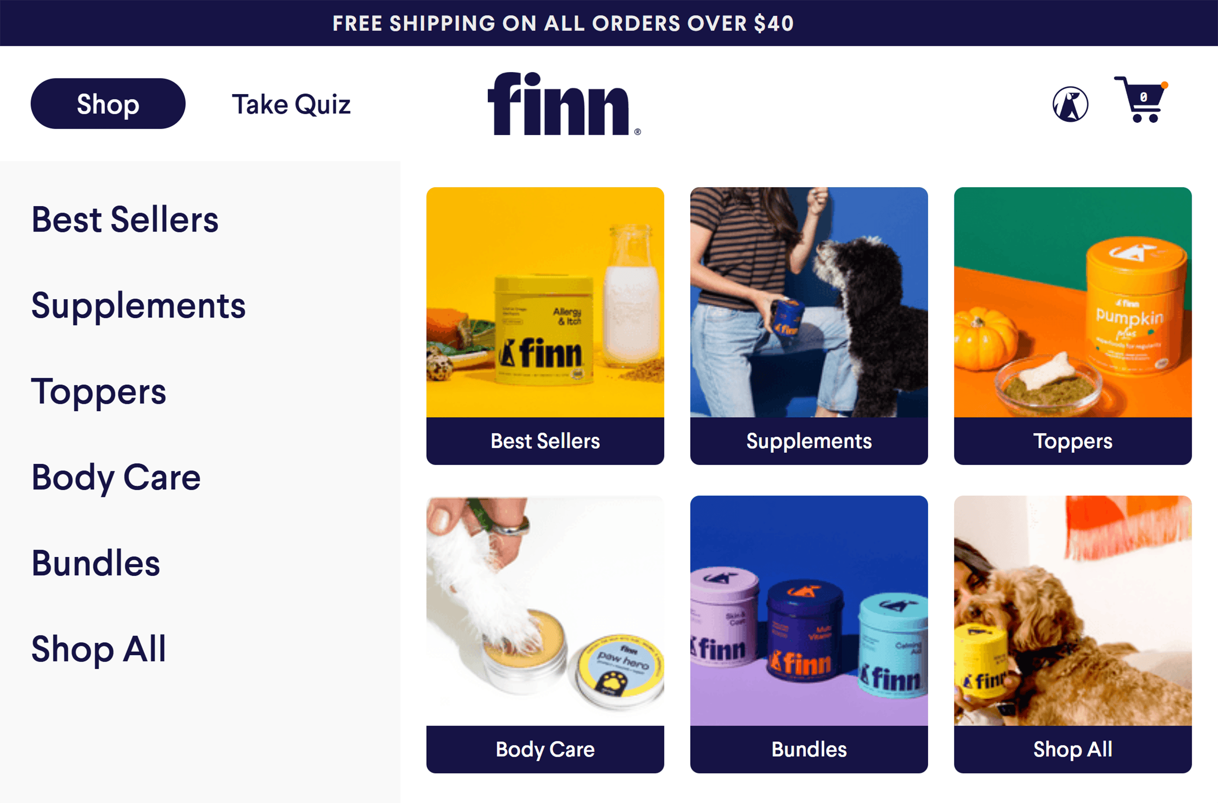
Finn, a dog vitamin company, features a clean website design.
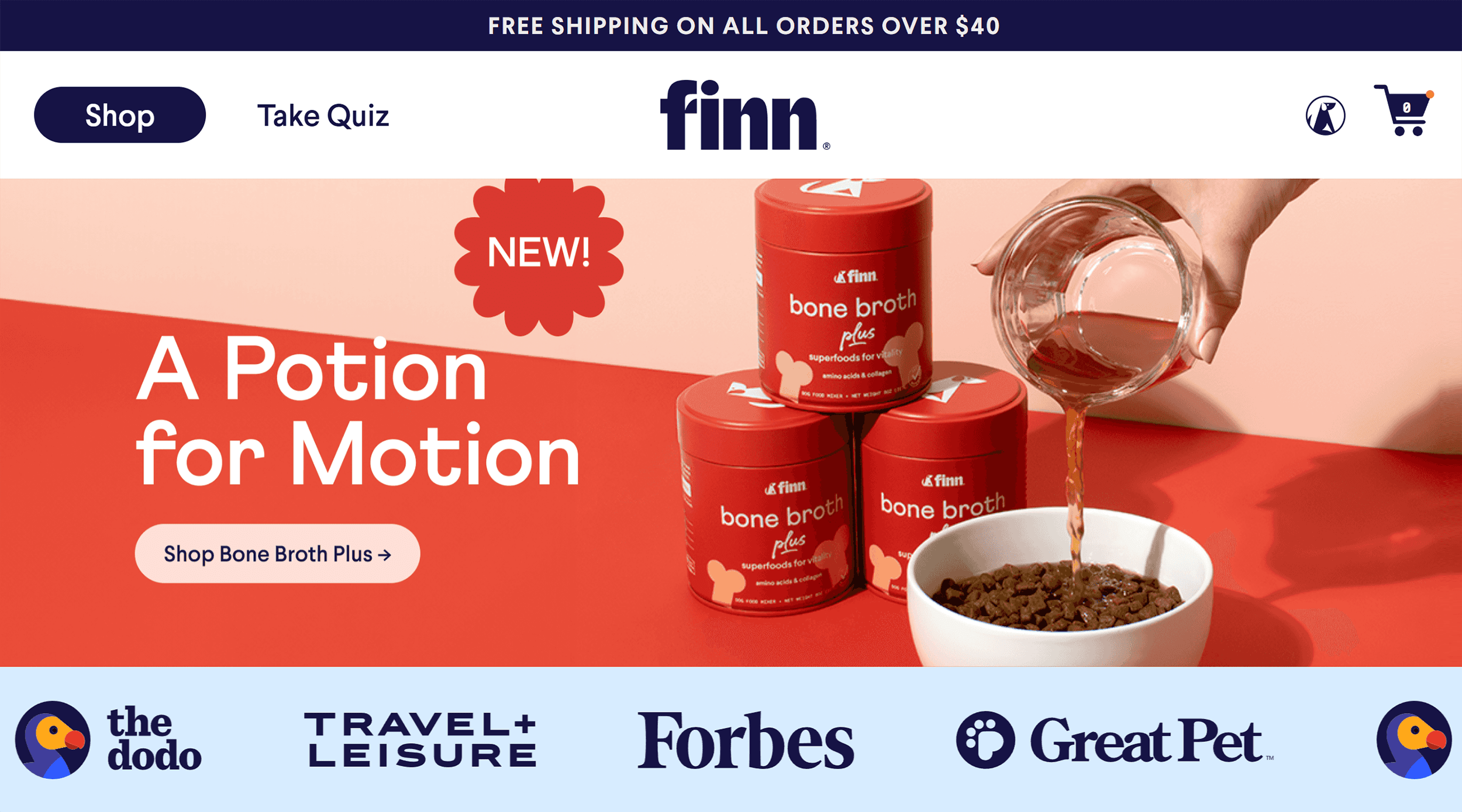
The vibrant colors pop from plenty of white space. Which looks fresh and modern.
But most importantly, the clean layout guides shoppers to what matters most—the product and how to buy it.
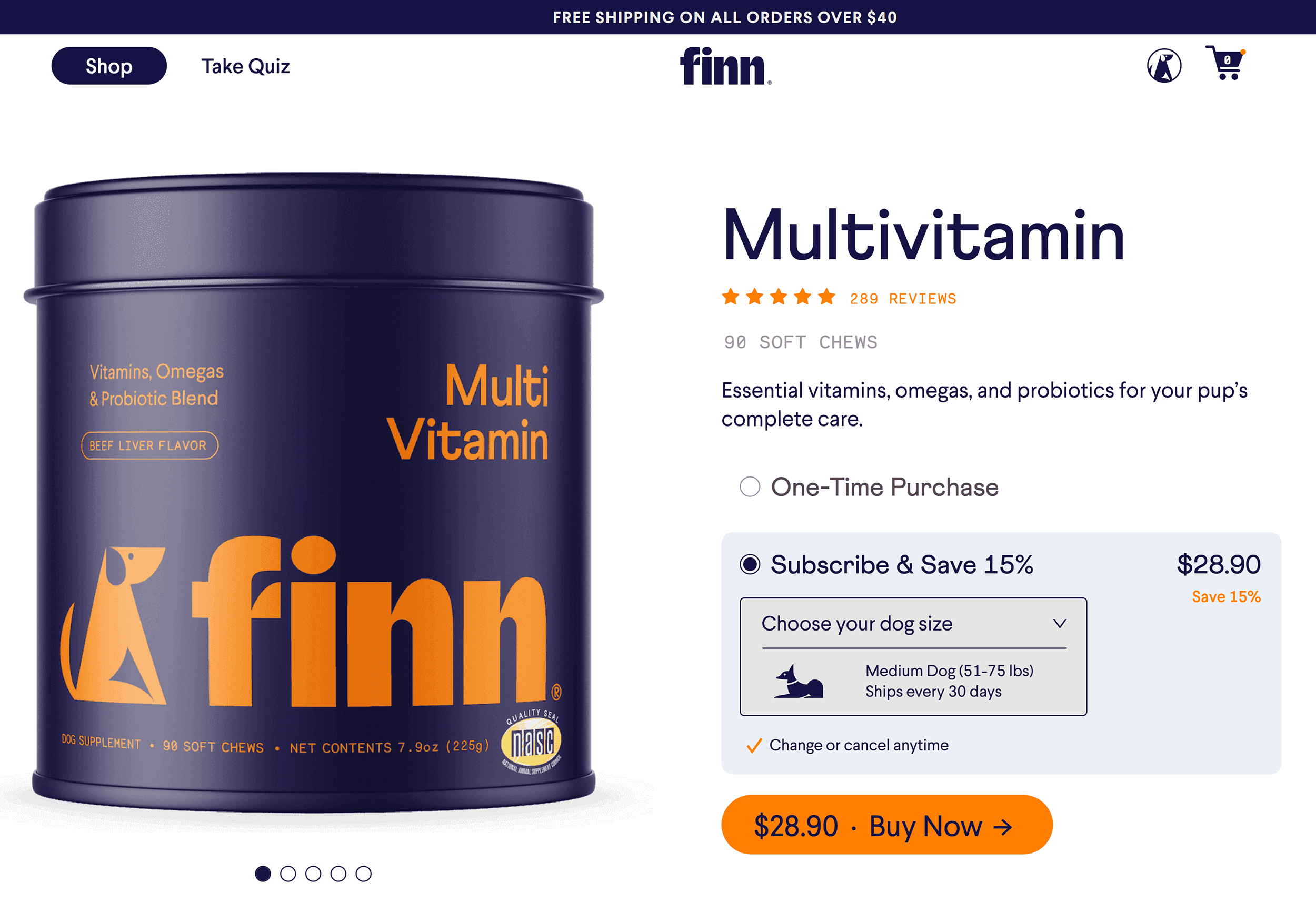
Here’s what Finn does right:
- The navigation bar is simplified and leads shoppers to key pages
- Product images are large and clear
- Shoppers see the product, price, and “Buy Now” button on the screen without having to scroll through the page
- Shoppers can scroll through the product images to find more information
Recess
Recess sells refreshing drinks that help you chill out.
And its website design perfectly matches that vibe.
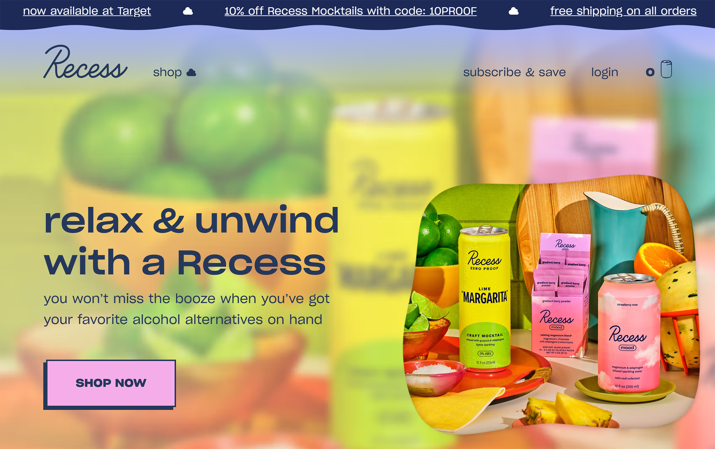
The site’s design uses vibrant pastel hues and fun animations.
As you scroll down the page, Recess’s drinks float around the screen.
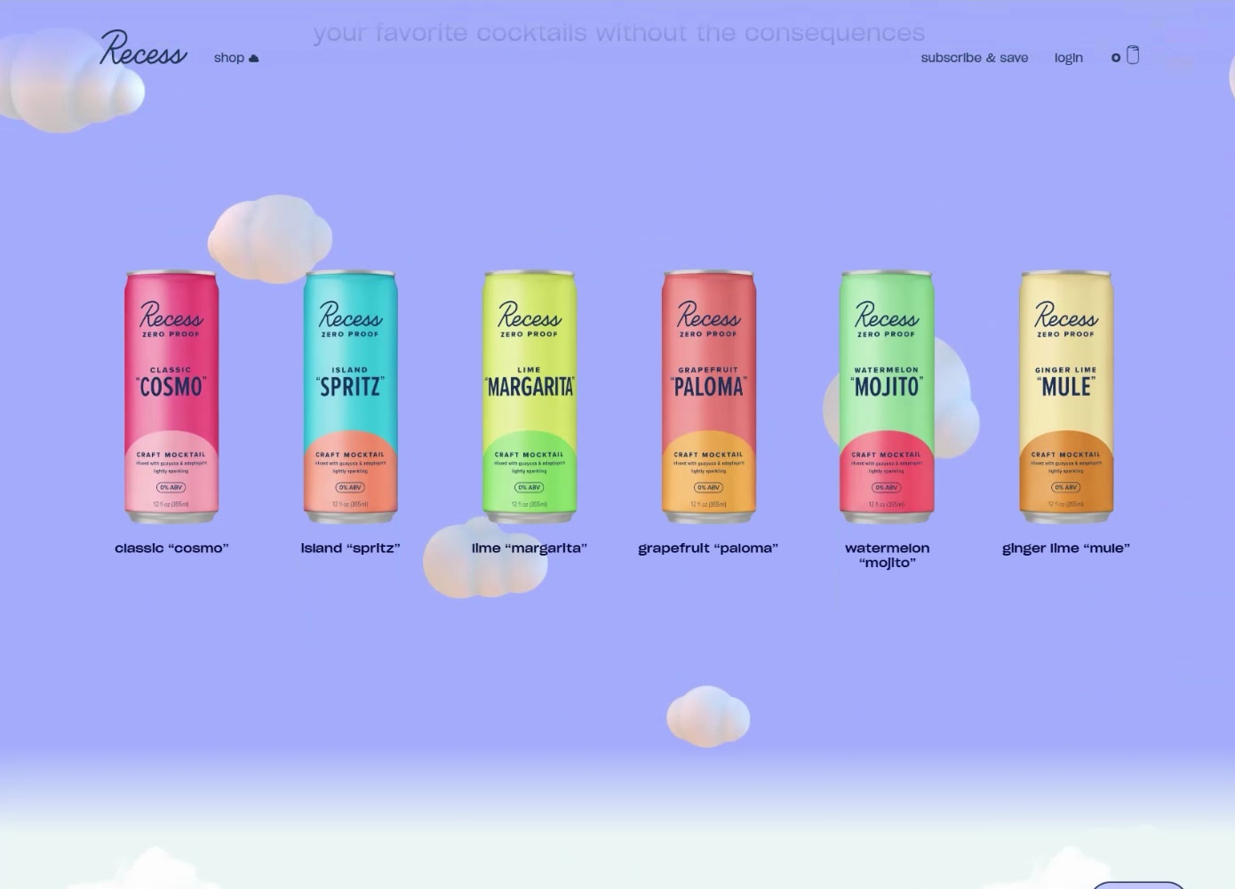
This turns a simple shopping trip into a playful experience.
Recess also keeps things simple with easy-to-use navigation menus and buttons.
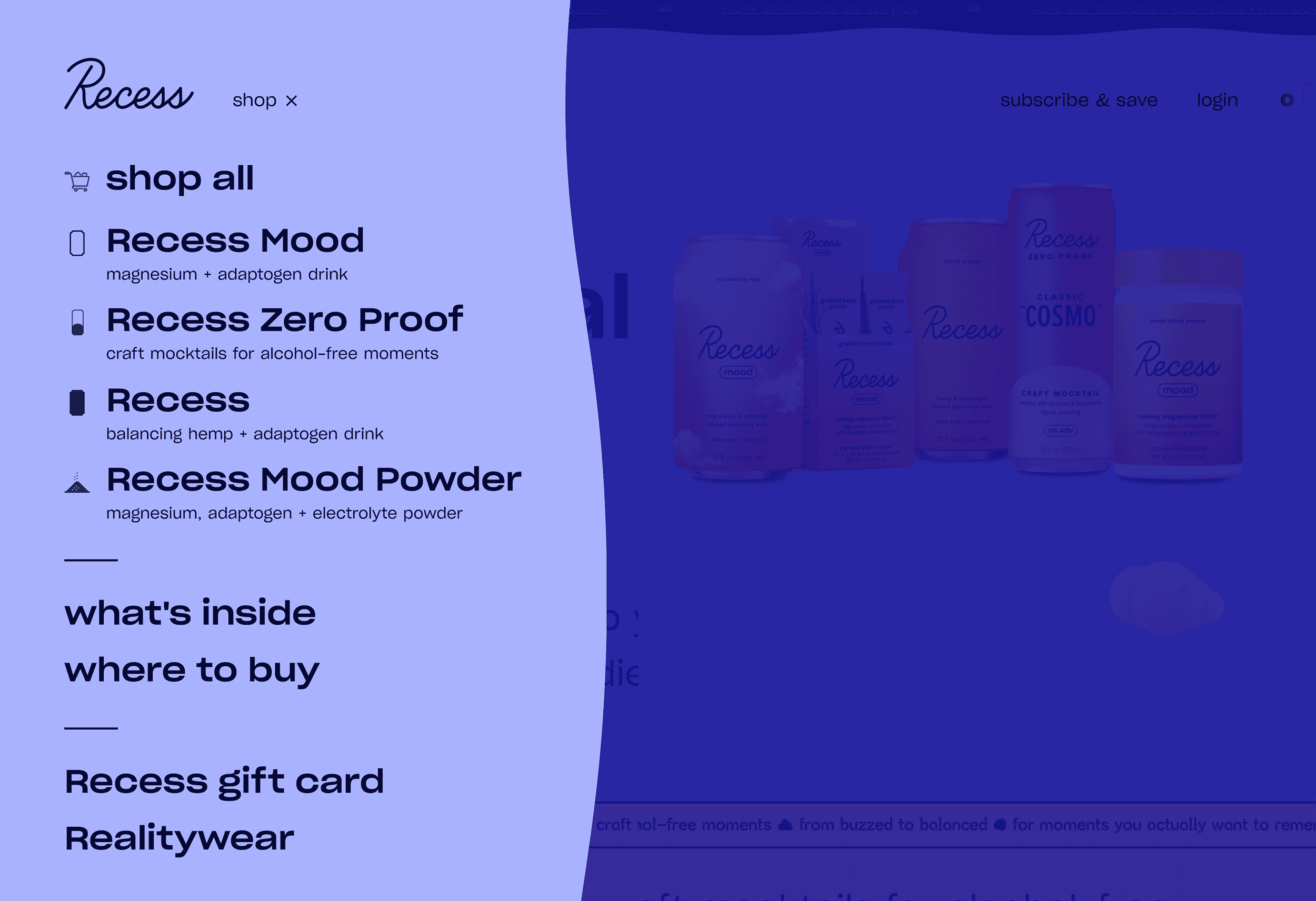
This makes it easy for shoppers to find what they’re looking for or explore the drink options.
Ready to Design Your Ecommerce Website?
Your website’s design is one of the first impressions a customer will have of your brand.
Make it count.
Ensure your site has a mix of style AND substance to turn browsers into buyers.
This includes an intuitive layout and a smooth shopping experience.
The best ecommerce sites never stop evolving. Test, learn, and optimize based on shopper feedback and conversion rates.
Want to drive more traffic and sales to your new site?
Check out our guide on ecommerce marketing, where you’ll learn how to optimize pages for SEO, set up Google Shopping ads, and more.


